





Euspa
Client: Client: EUSPA competition
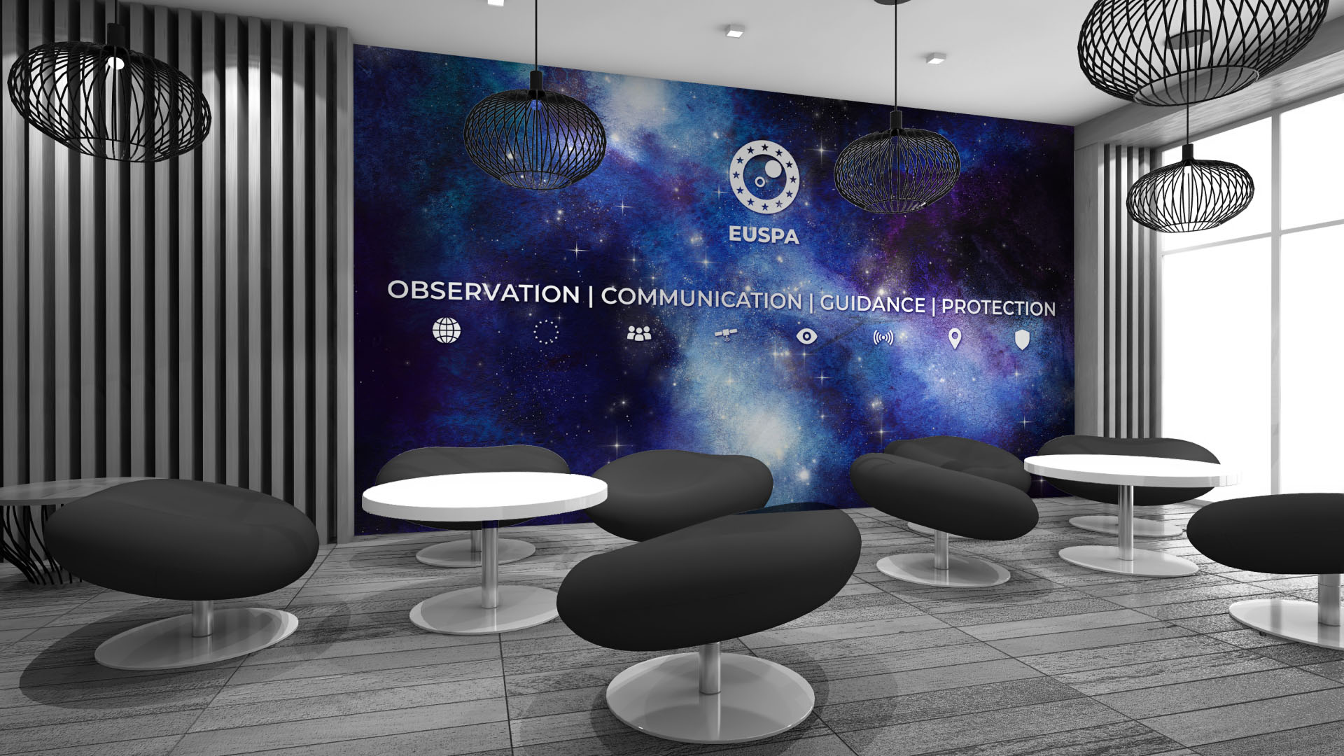
Slogan: observation – communication – guidance – protection
Services: Branding
What we did:
The Challenge / The Goal
EUSPA (European Space Programme Agency) announced an open competition for a modern, definitive visual identity capable of establishing absolute authority and cohesion across its European space operations. The strategic objective was the creation of a brand system that moves away from a fragmented institutional aesthetic and builds a commanding, unified presence, communicating absolute precision, innovation, and European unity on a global and cosmic scale.
The Solution / Our Approach
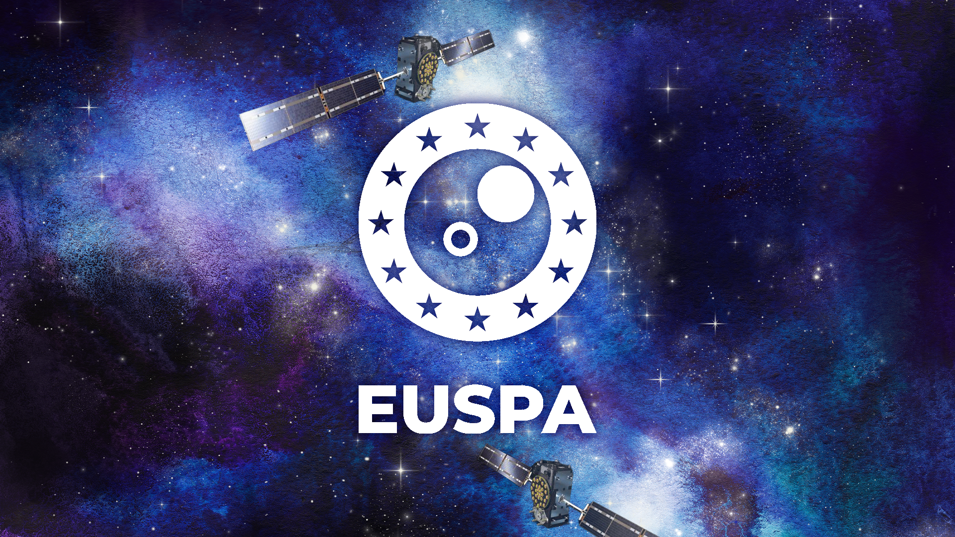
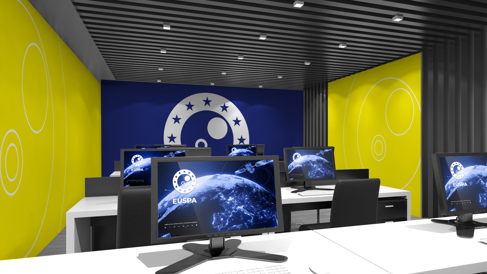
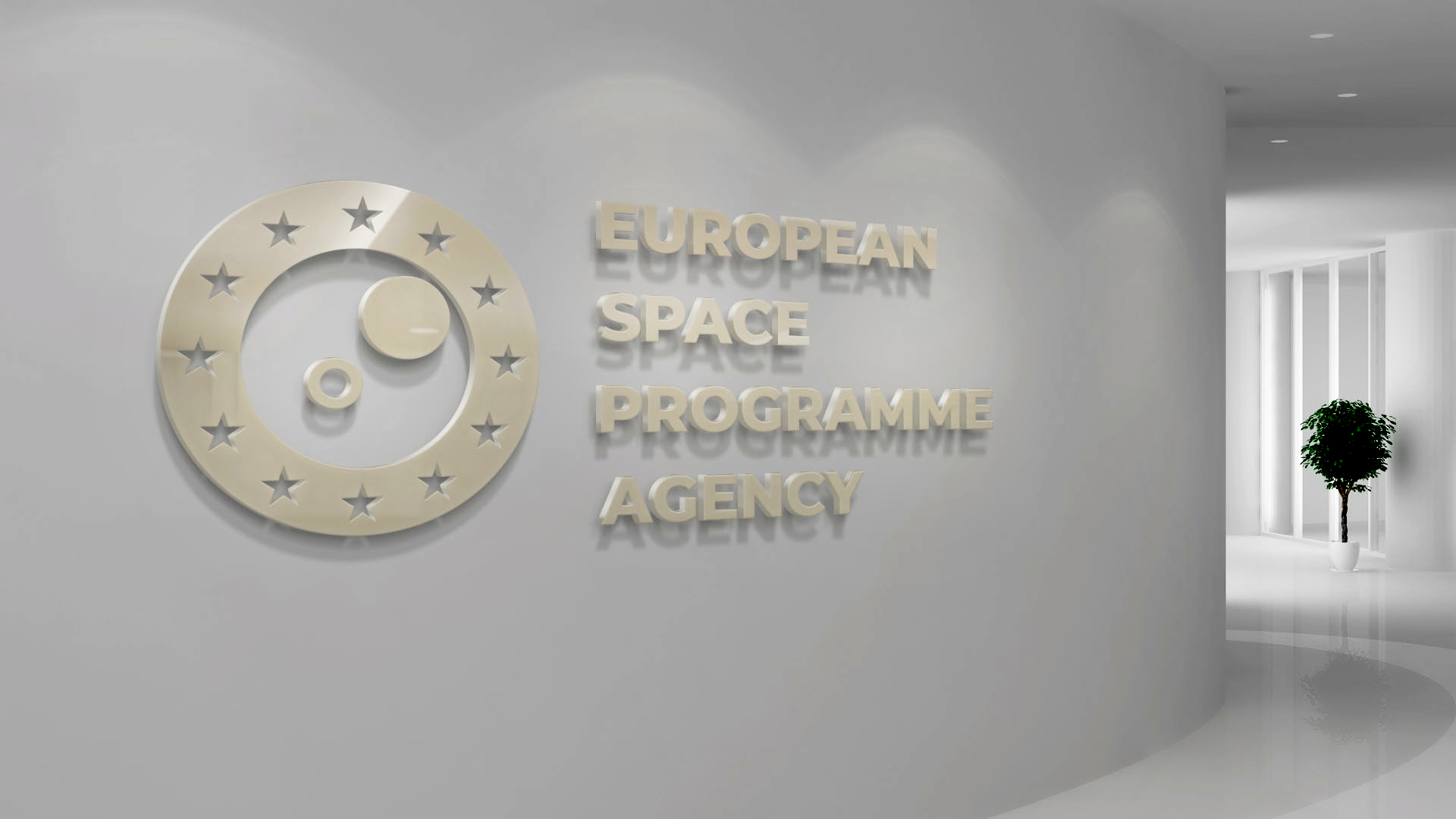
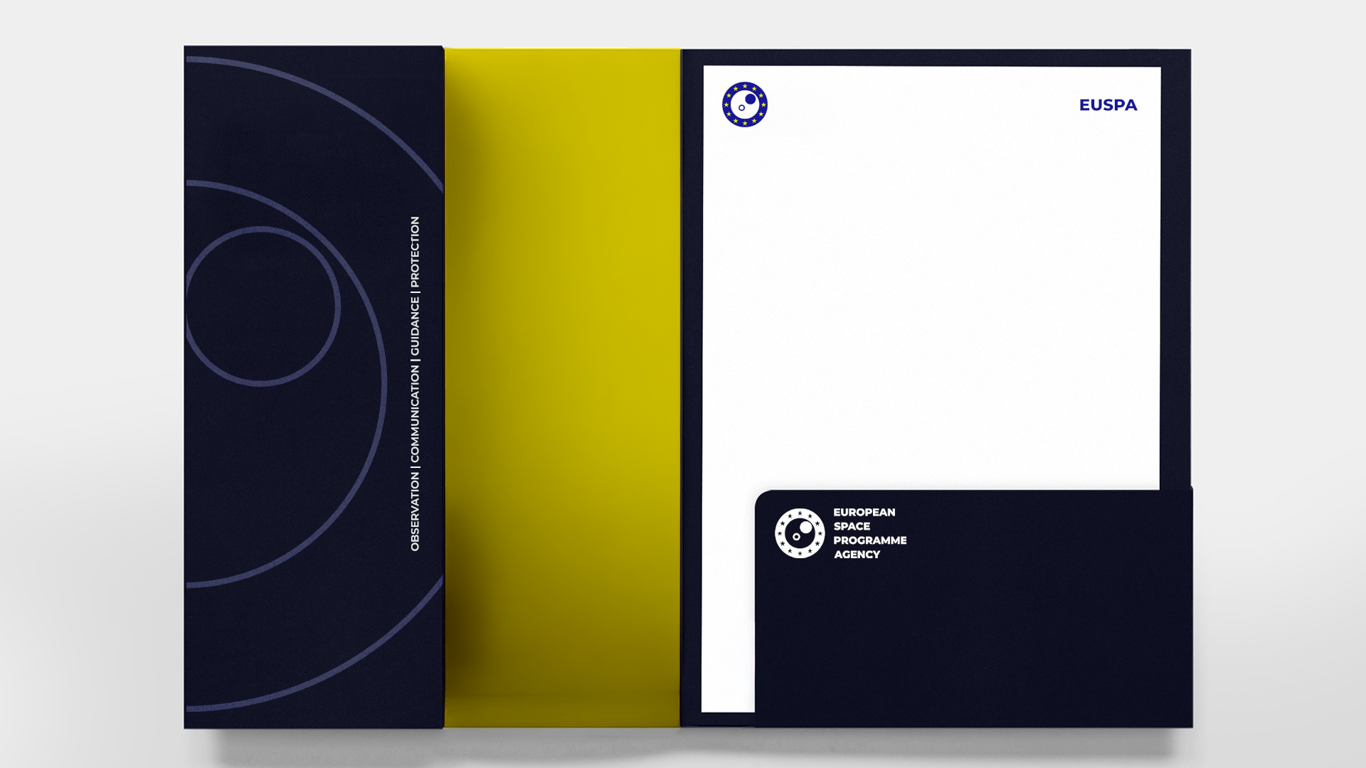
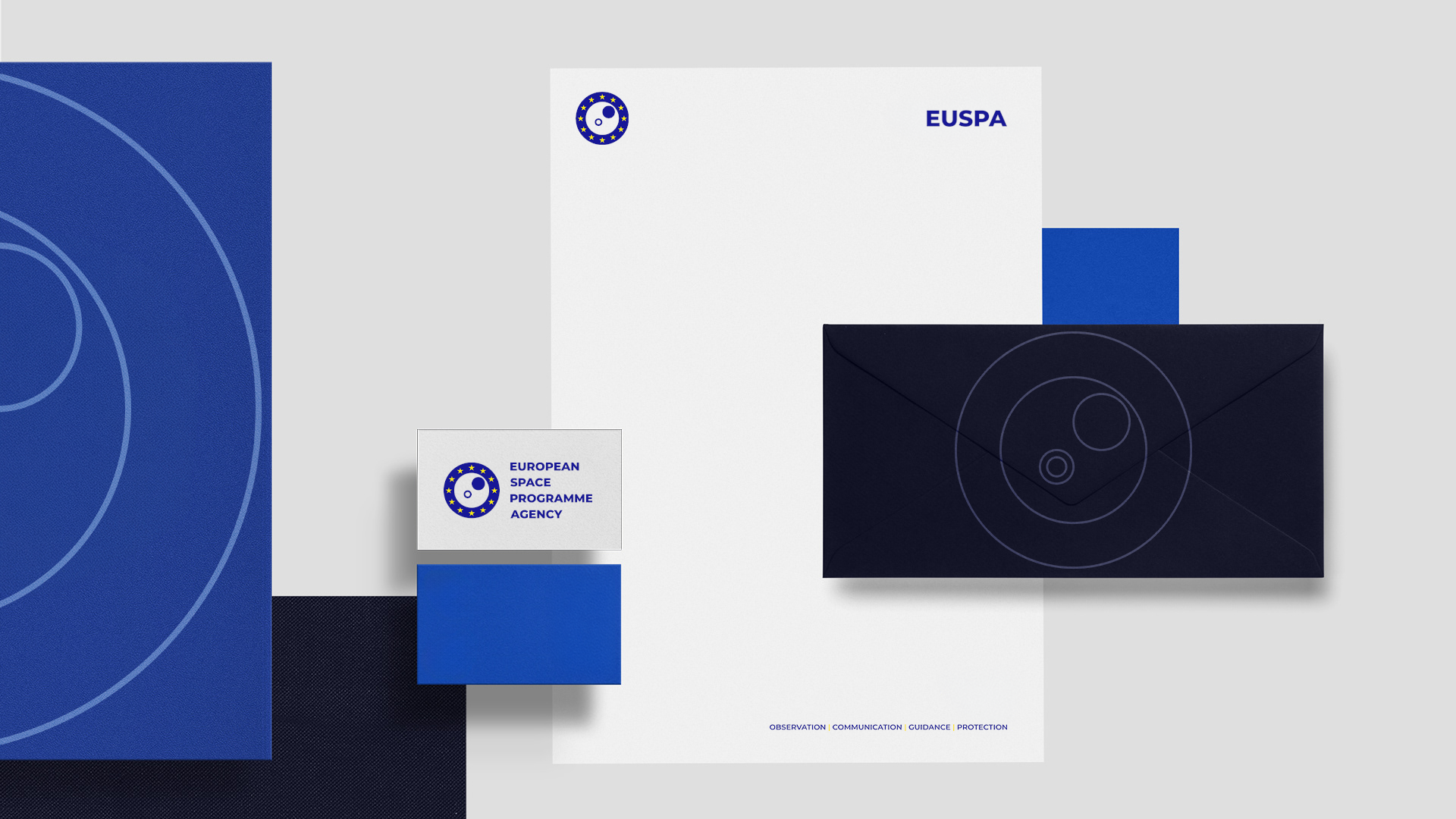
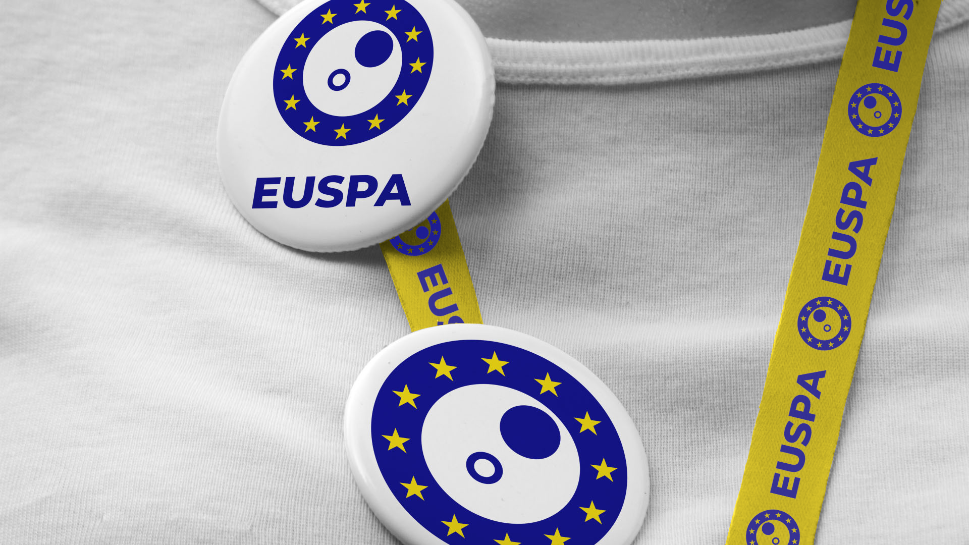
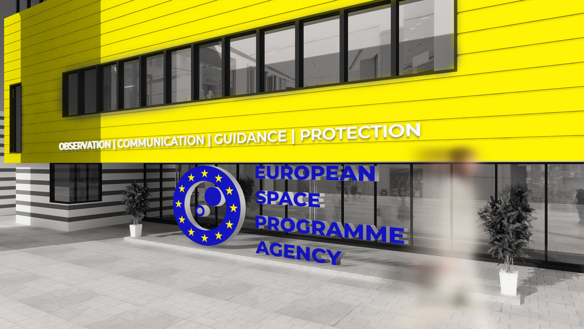
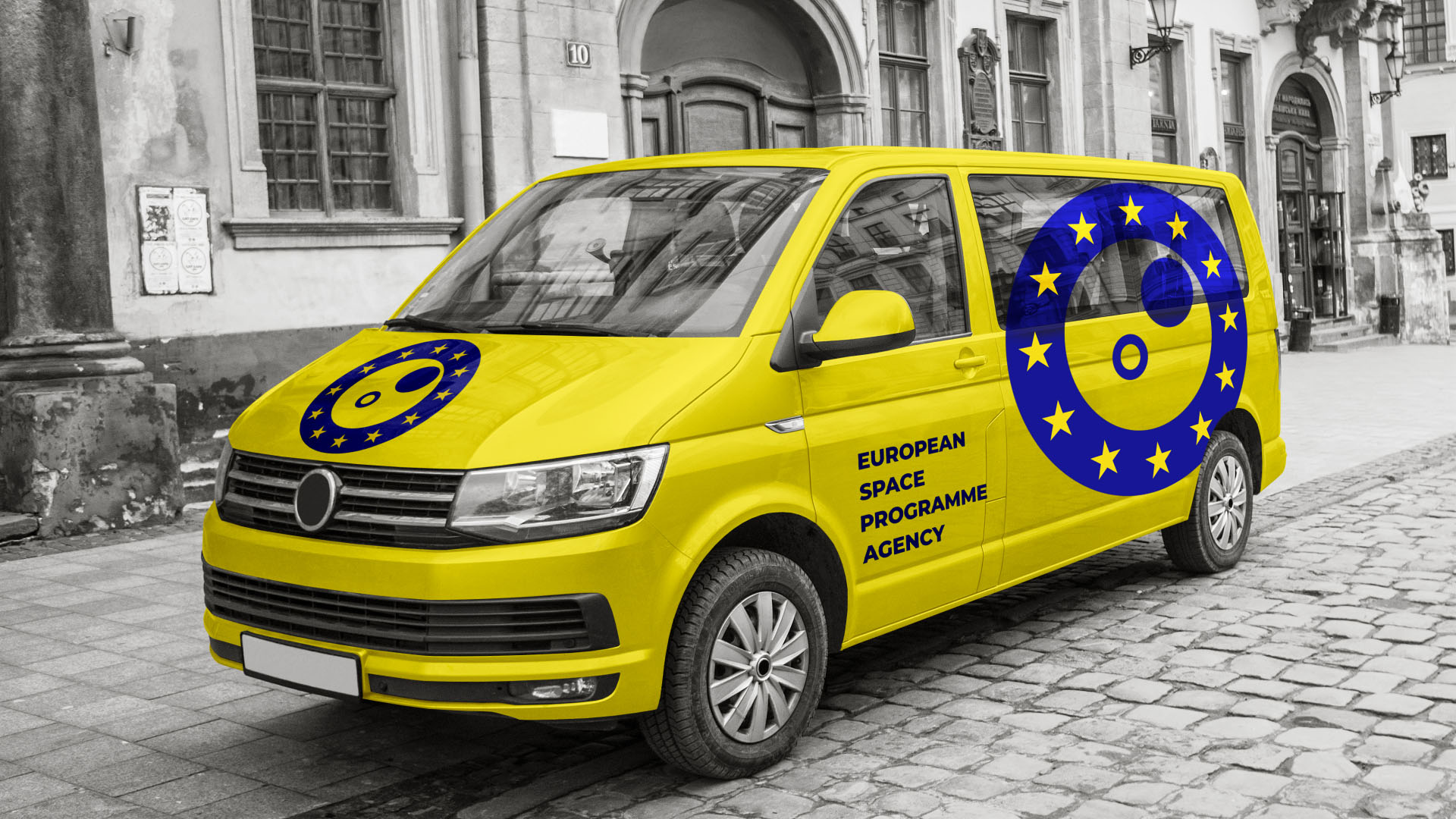
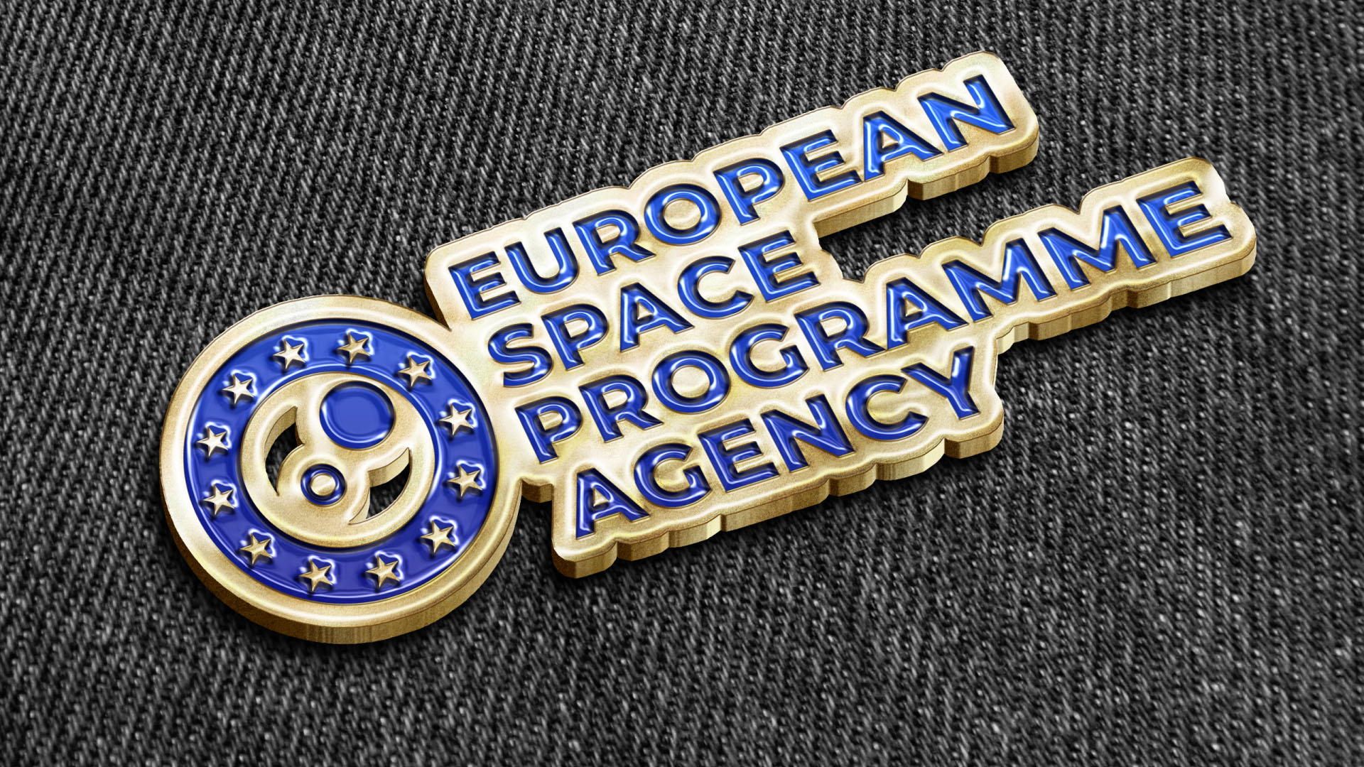
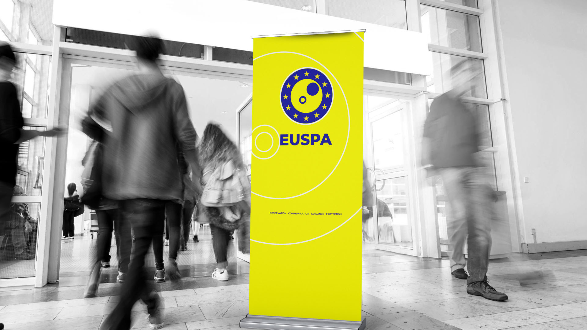
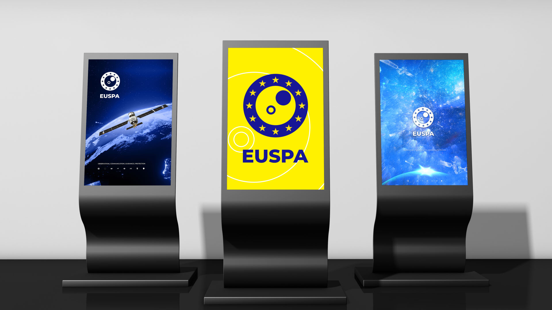
We designed a bold, scalable visual language centered around the distinctive European blue and yellow, utilizing a minimalist orbit and celestial body motif surrounded by the twelve stars of unity. This powerful brandmark was systematically applied across a comprehensive suite of applications, ensuring flawless legibility whether rendered on premium corporate stationery, physical and digital office spaces, or dynamic corporate vehicle signage. We extended this cohesive experience to digital touchpoints, such as mobile app icons, modern digital totems, and immersive conference presentation screens. For physical impact and institutional pride, the branding was meticulously adapted into high-quality enamel pins, striking roll-up banners, and official embroidered patches for astronaut suits.
The Result
Our proposal for the new EUSPA identity offered an uncompromising, premium institutional aesthetic that positions the agency at the forefront of global space exploration. The final brand ecosystem is highly adaptable, instantly recognizable, and projects institutional gravity and technological supremacy, securing EUSPA’s strategic position as a leading entity in the global aerospace sector.
Date:
31/07/2025


