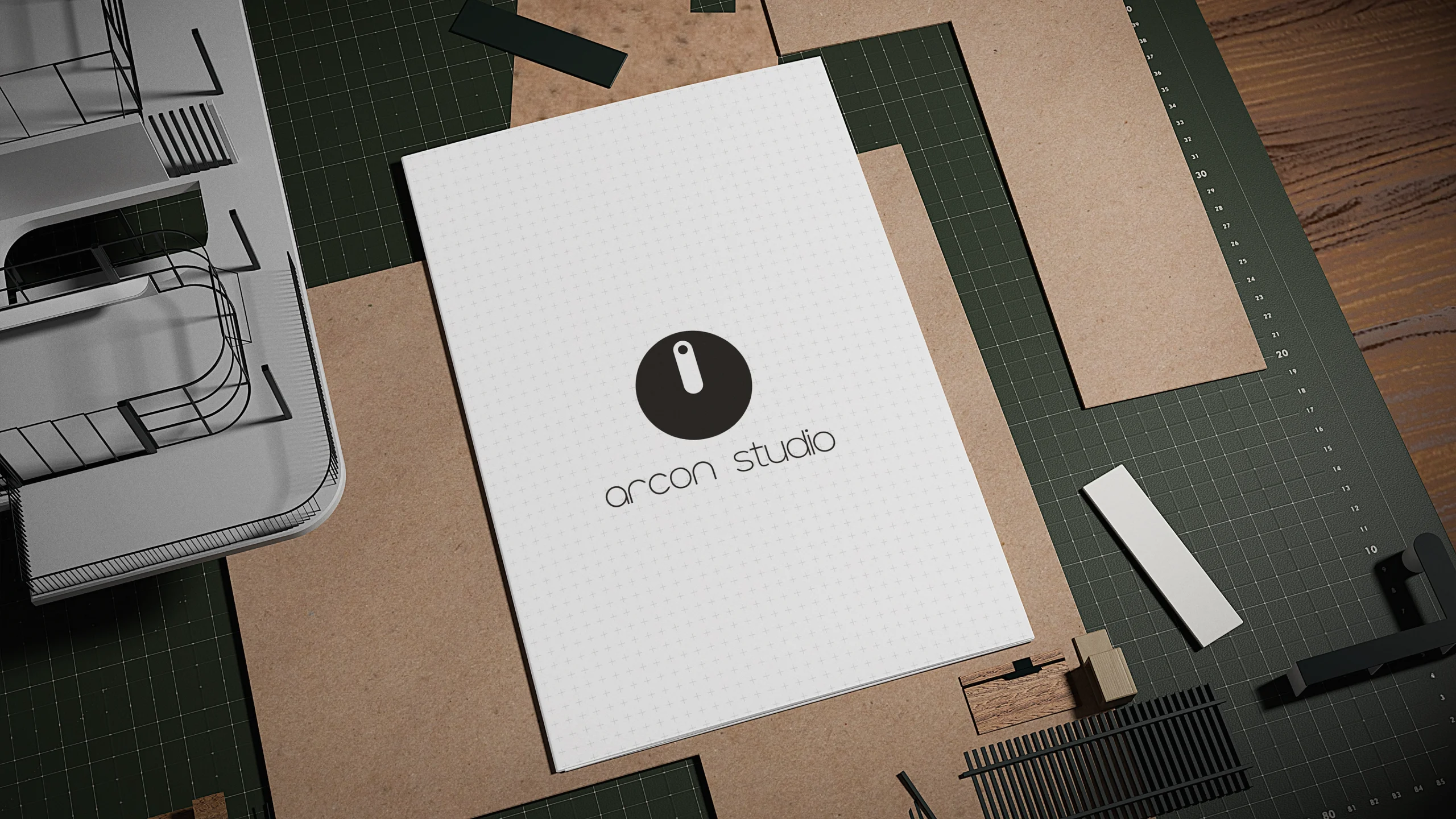
Arcon Studio
Client: Arcon Studio
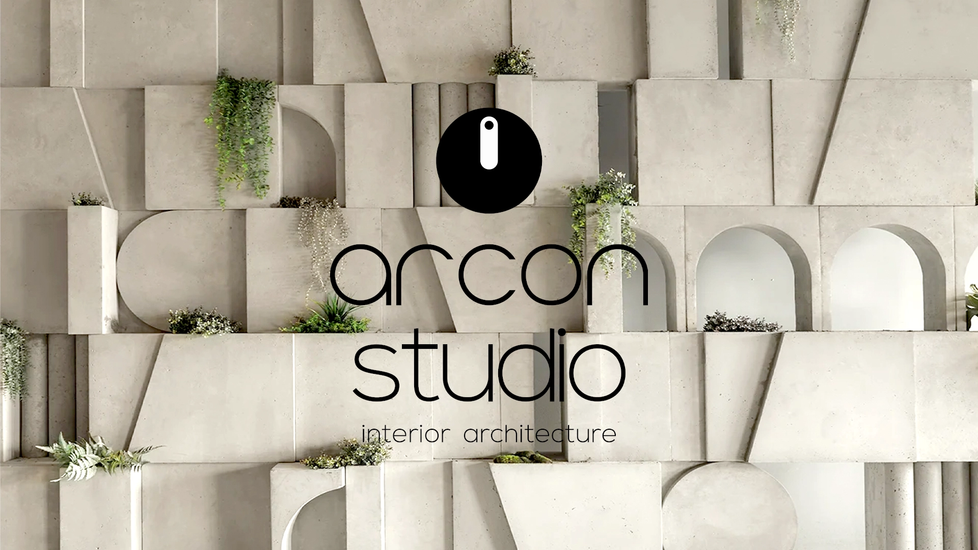
Slogan: architecture is on
What we did: The core objective for Arcon Studio was to forge a striking visual identity that mirrors the structural integrity, geometric precision, and organic harmony of contemporary interior architecture.
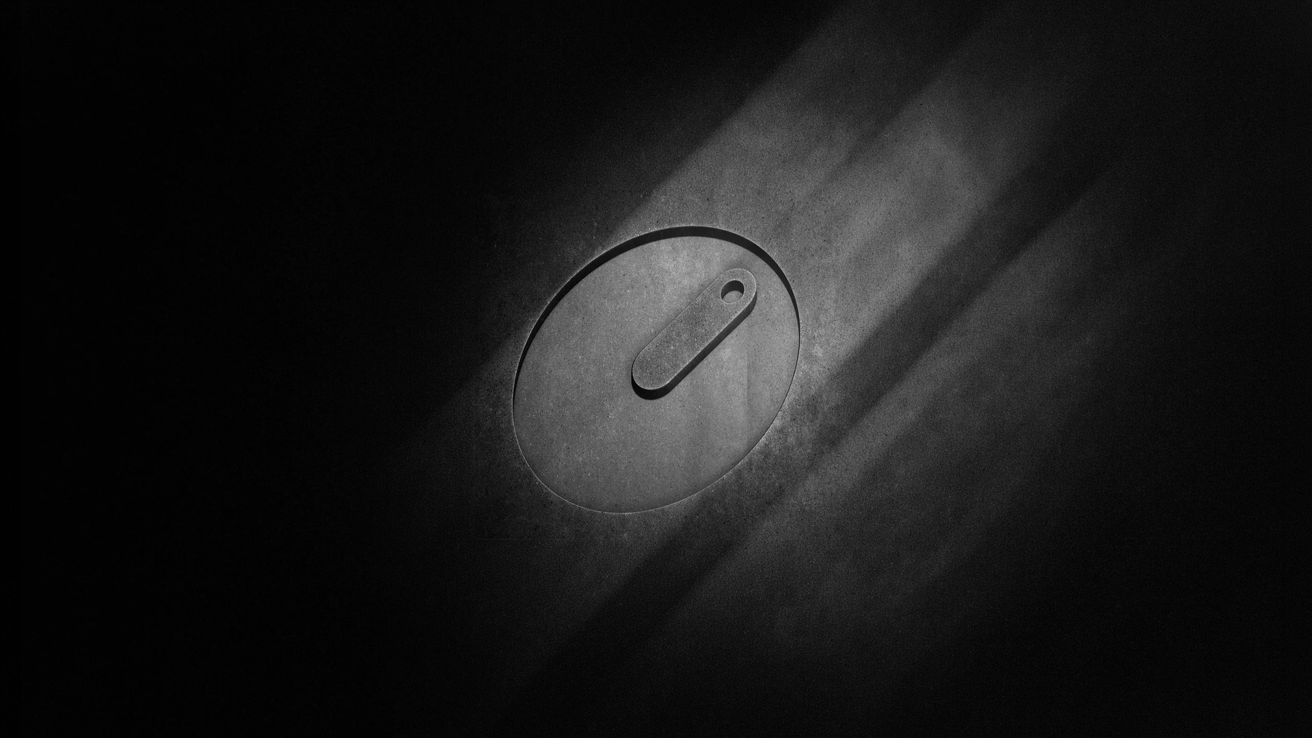
To achieve this, the brand identity anchors itself on a bold, minimalist logotype and an abstract circular brand mark containing a single vertical slot, reminiscent of an architectural toggle switch
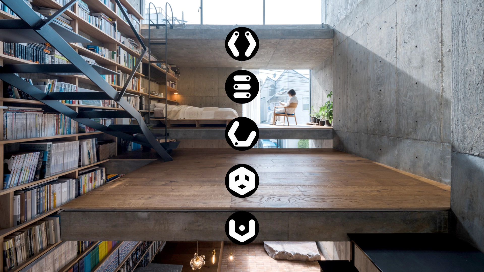
or a precise structural column. This design philosophy transitions seamlessly into a broader corporate vocabulary through a series of five technical service icons that denote different operational phases, from initial concept to final execution.
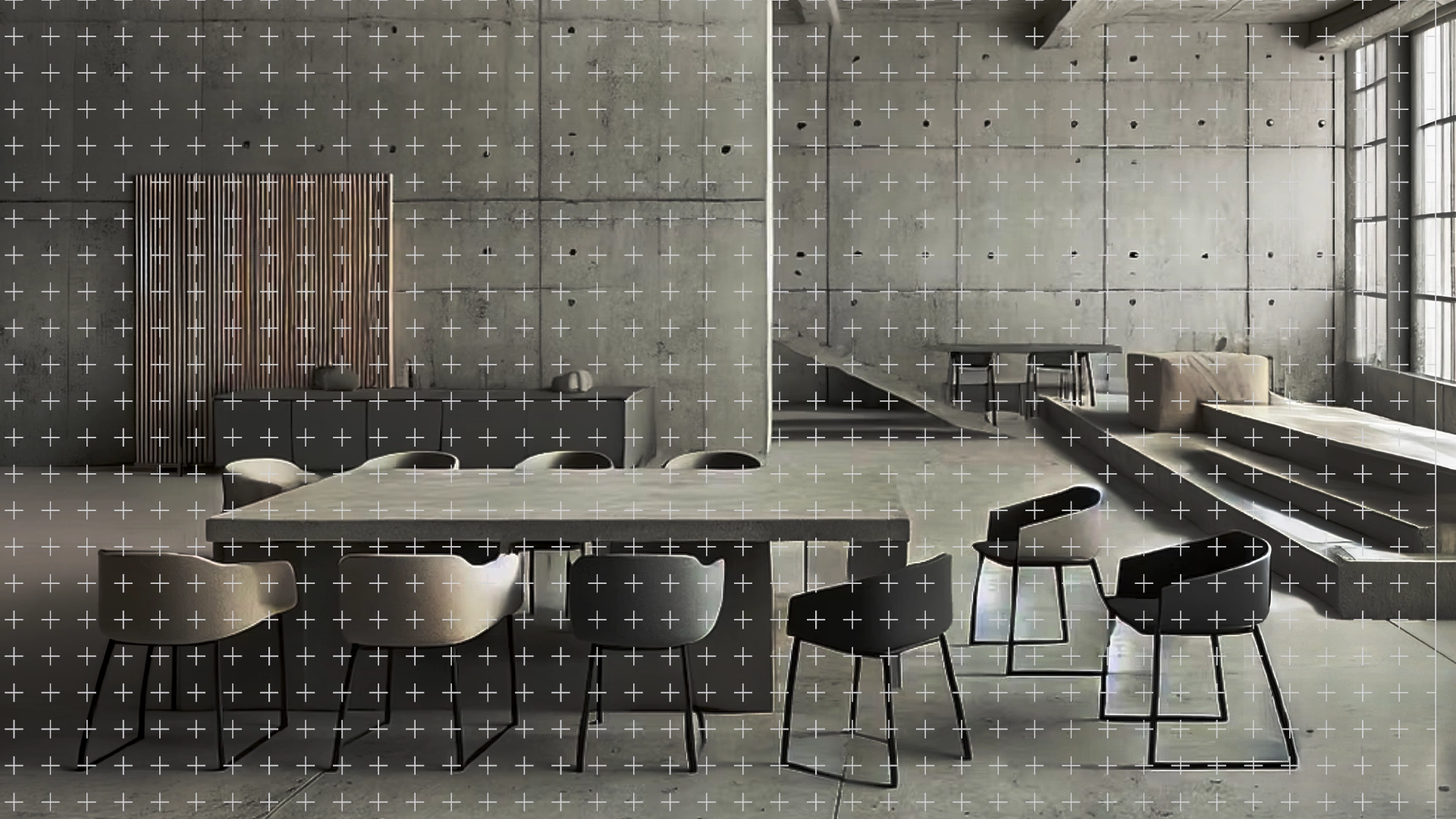
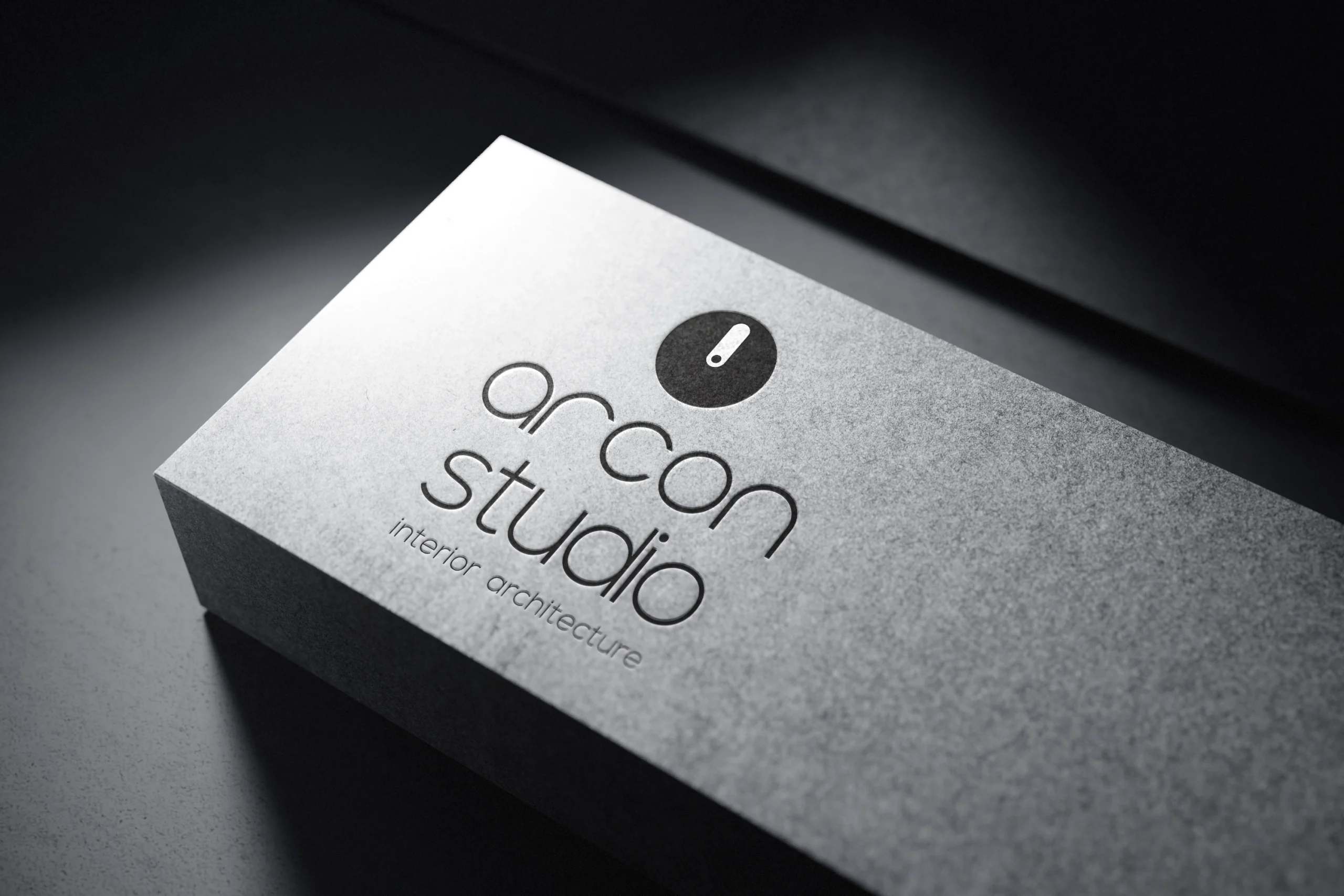
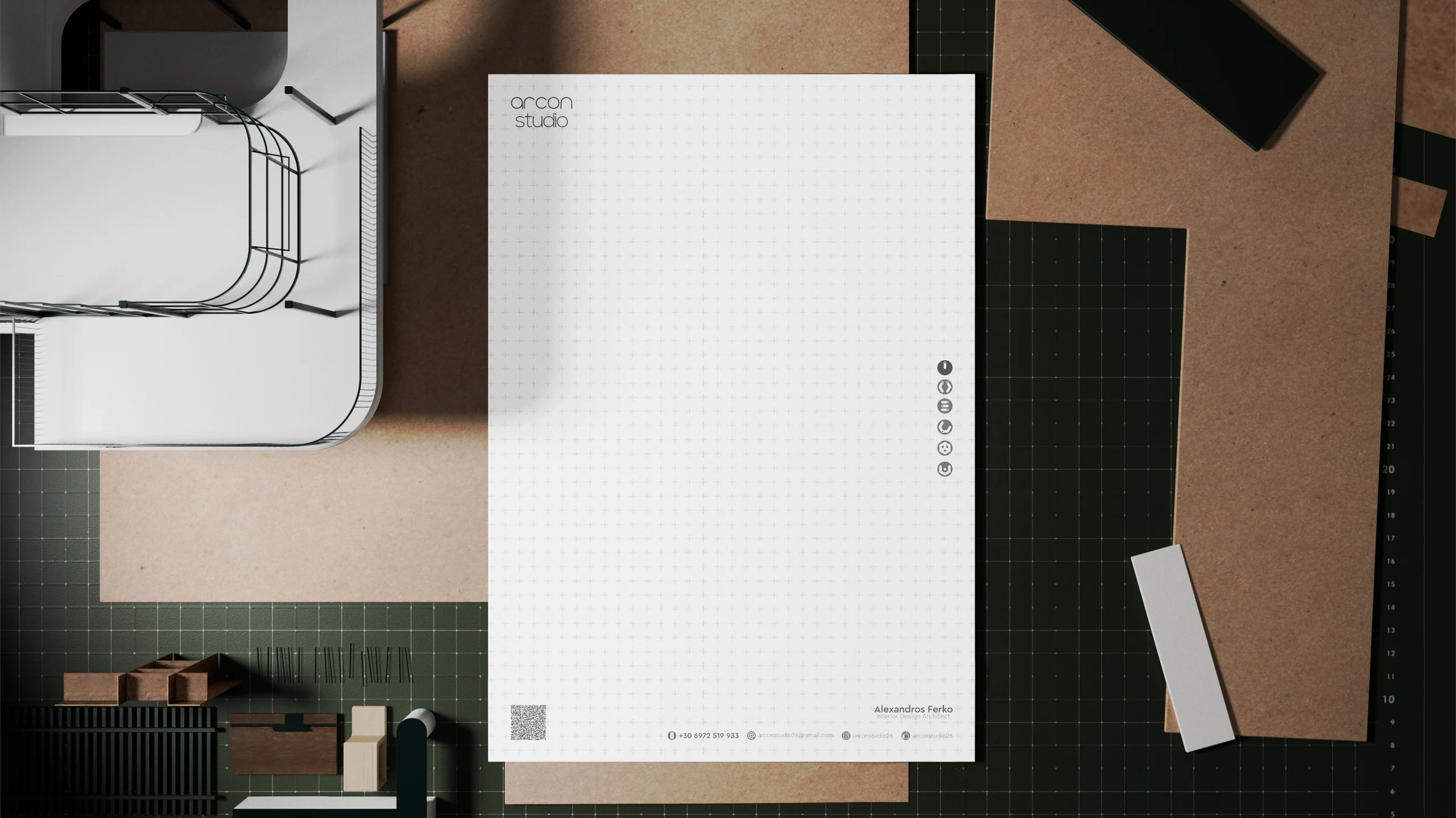
To maintain strict alignment across all spatial design layouts, a distinct white grid matrix system was introduced as a foundational canvas for the brand’s documentation. This disciplined design language translates directly into premium stationery and branded materials, utilizing an embossed monochrome logo on texture-heavy business cards and a tactile, debossed execution of the circular emblem on stark architectural surfaces.
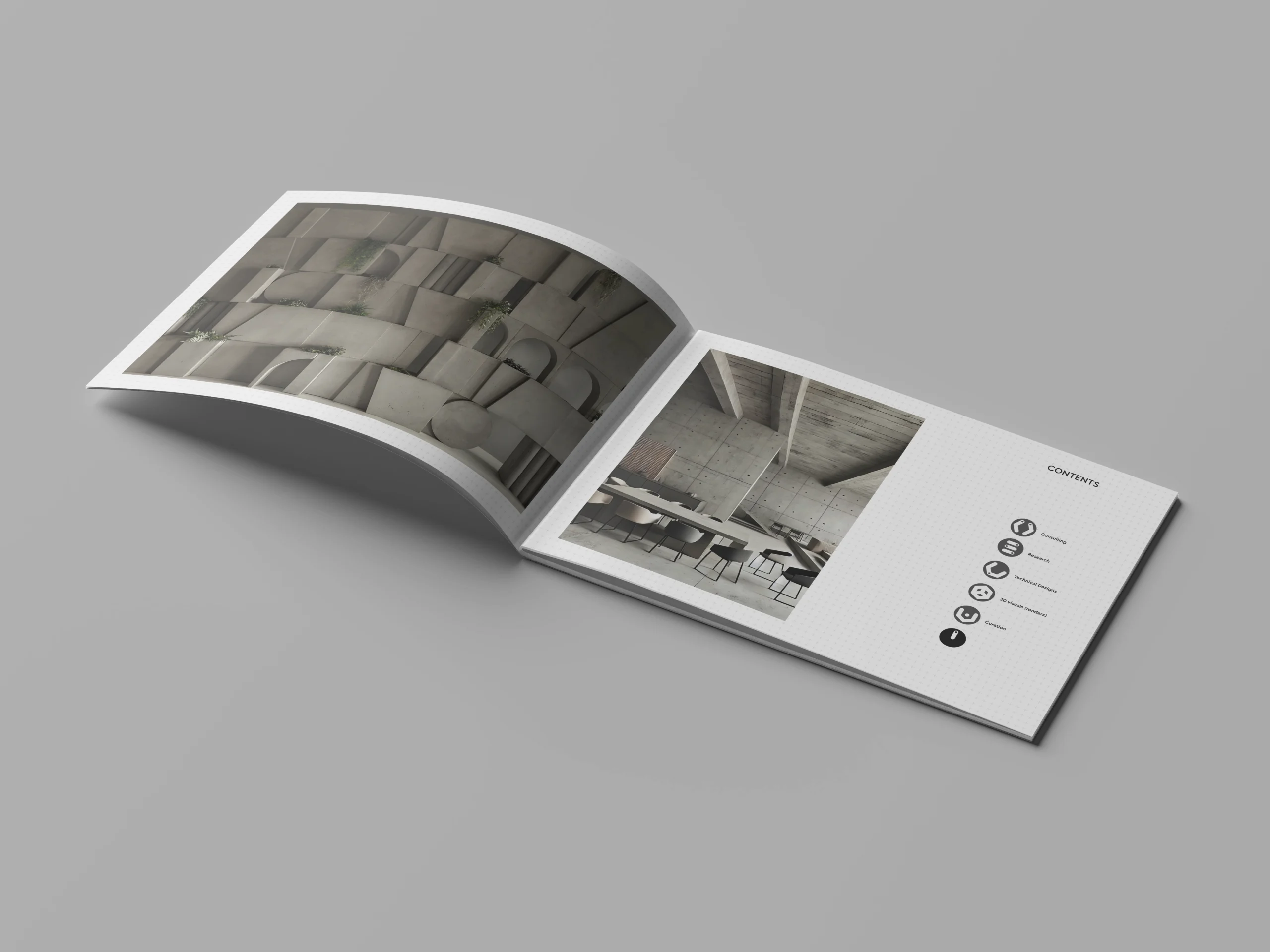
The studio’s day-to-day operations utilize this structural blueprint across highly organized communication media. The technical grid systems provide a neat framework for professional corporate letterheads and pristine project portfolio covers. To present their work elegantly to prospective clients, the studio employs a clean landscape layout brochure that clearly maps out the brand’s five core pillars—Consulting, Research, Technical Designs, 3D Visuals, and Execution—alongside full-page environmental renders.
By blending a rigid layout grid with fluid architectural textures, the identity captures the essence of a modern studio where spatial form meets precise execution.
Date:
04/03/2026


