
ANASSA skincare products
Client: ANASSA skincare products
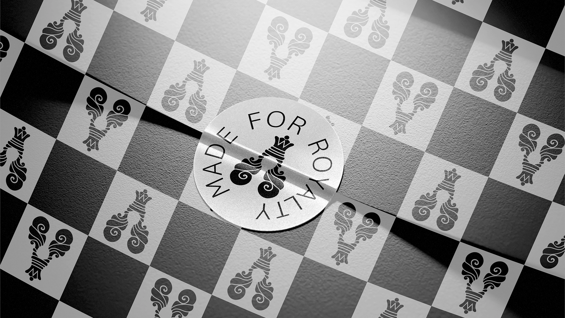
Slogan:Made for Royalty
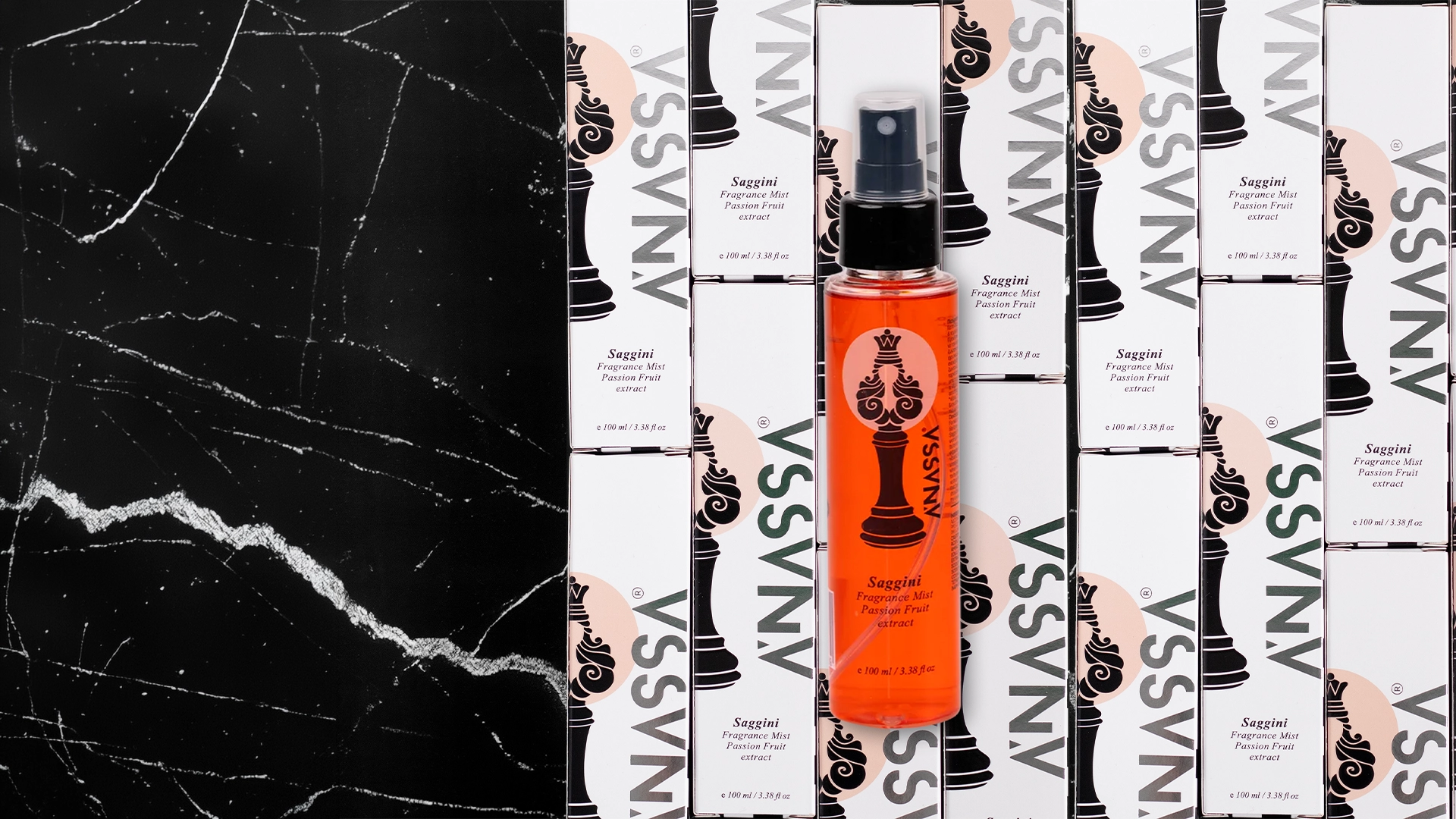
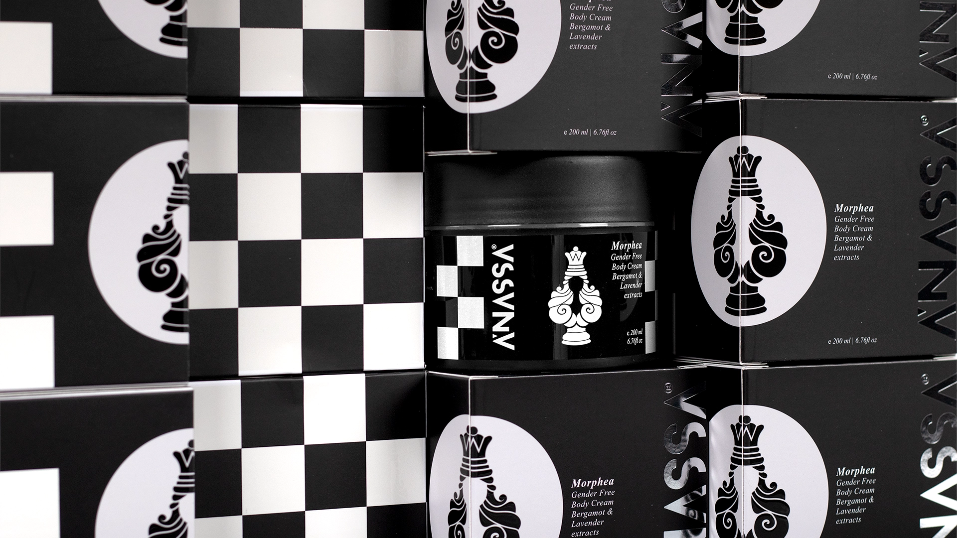
What we did:The branding concept was built upon the Homeric word “Anassa,” which translates to “Queen”. We designed a corporate identity that deconstructs traditional skincare stereotypes and redefines the essence of ‘royal’ care.
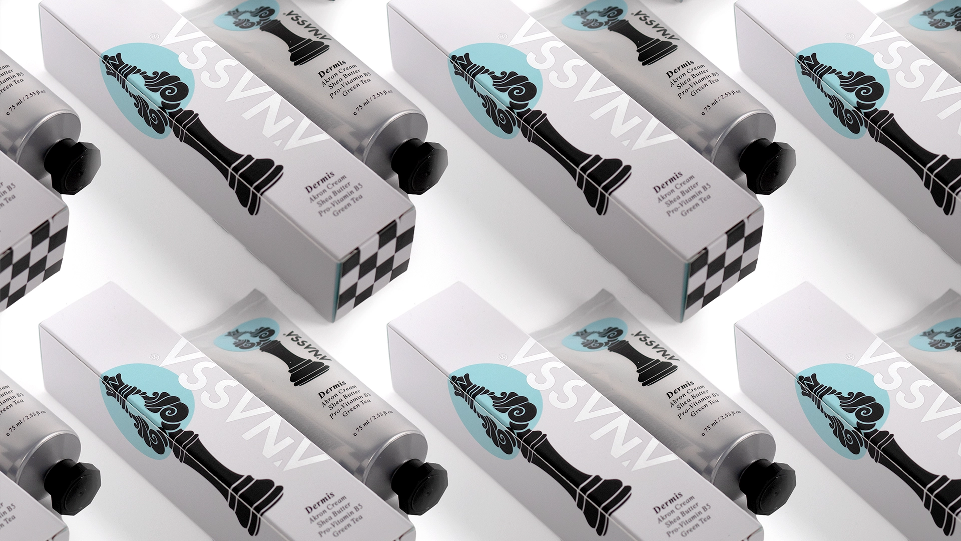
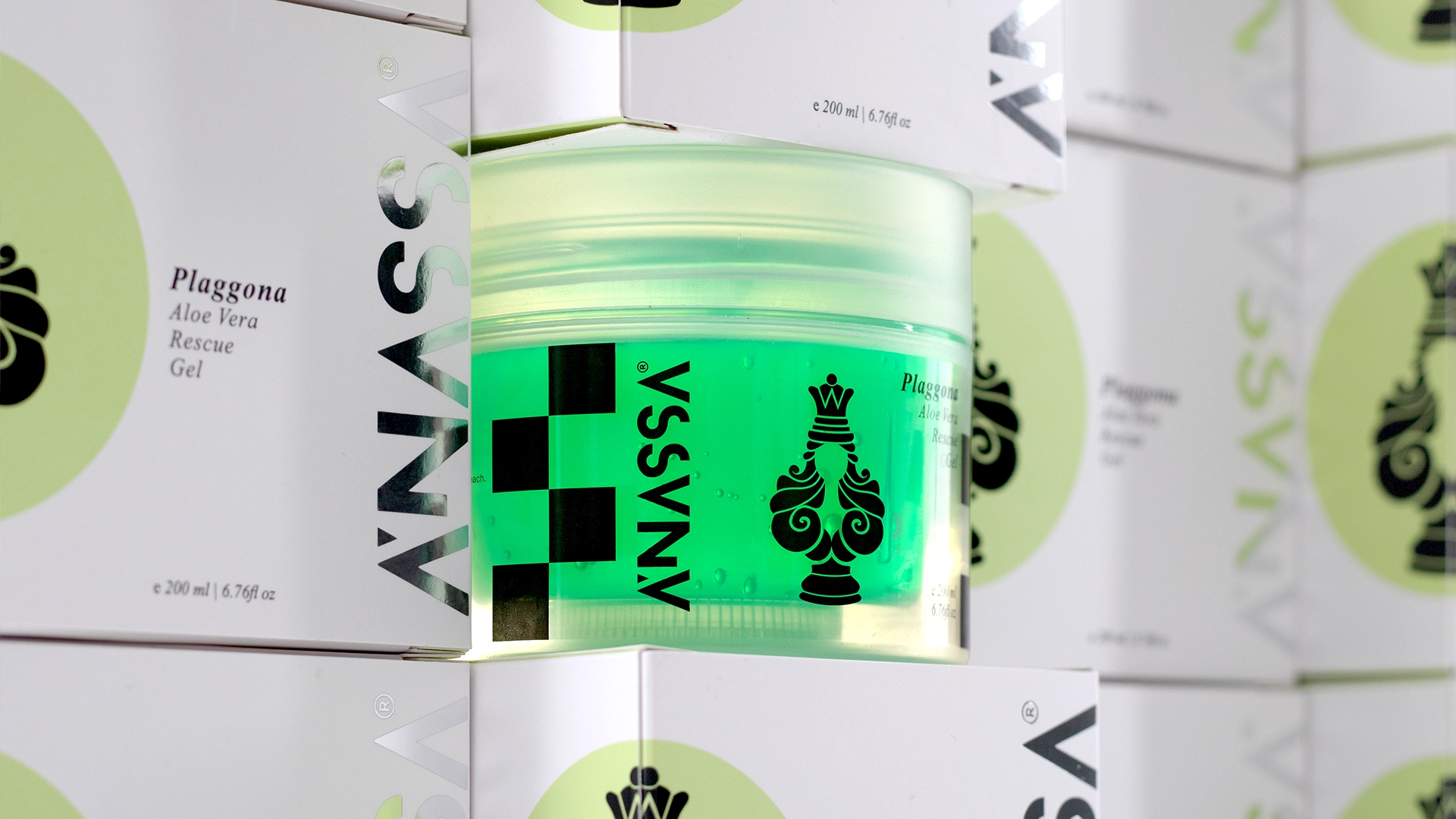
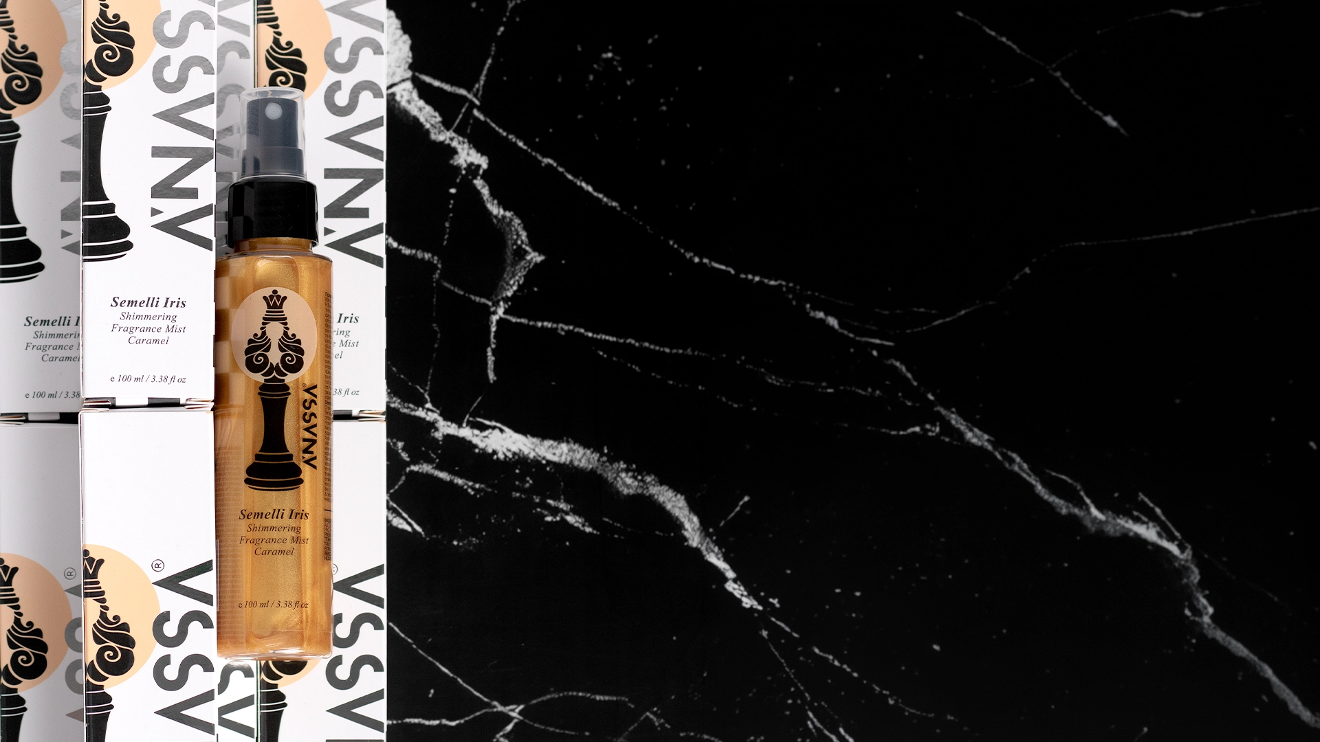
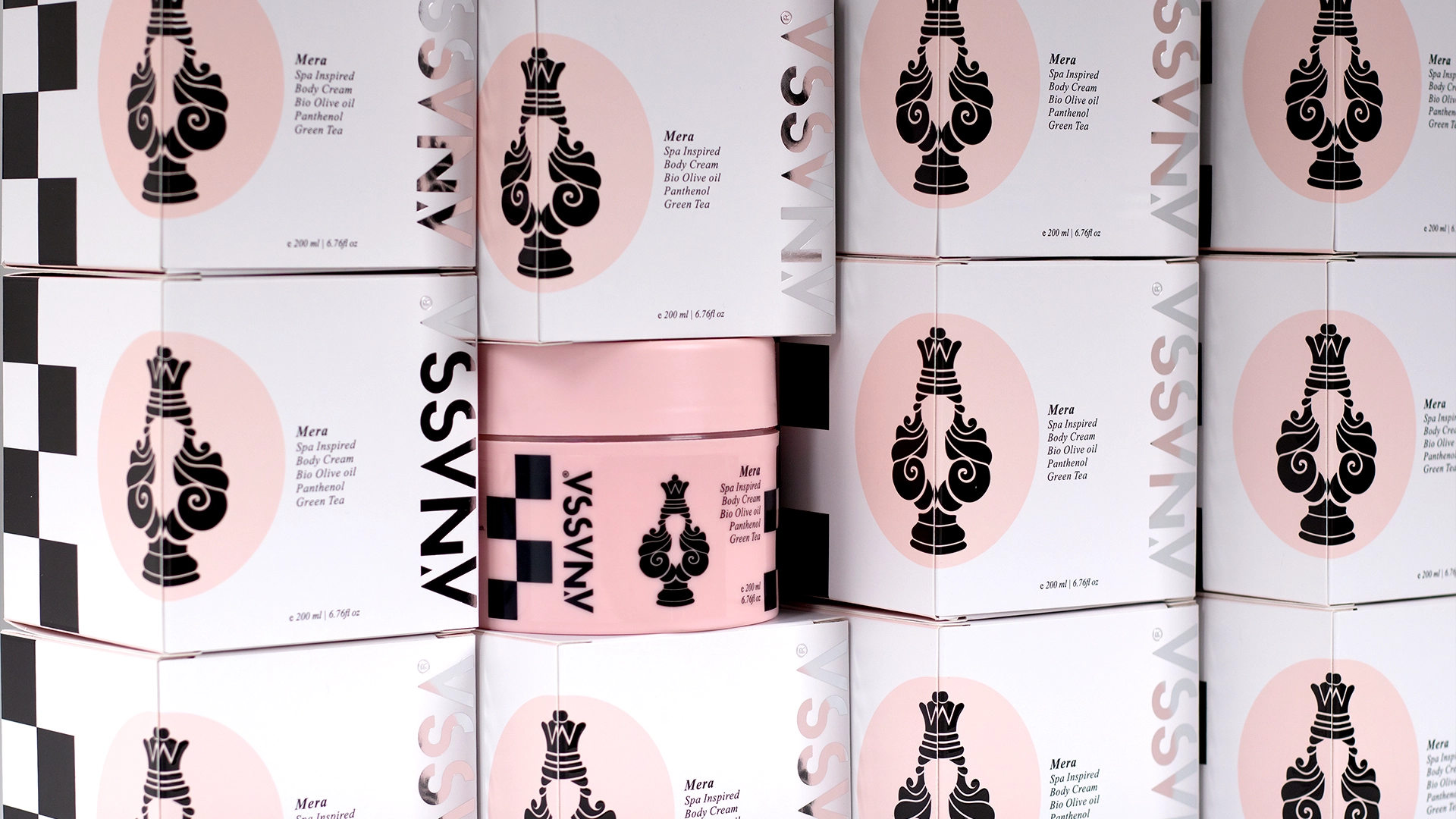
Inspired by the most powerful and versatile piece on the chessboard—the Queen—the brand mark encapsulates four distinct symbols: the crown of luxury, the curves of femininity, the delicate neck that overcomes obstacles, and the steadfast base of core values.
We paired a romantic, spa-inspired palette of pastel tones with an entirely fashion-forward, bold black-and-white checkerboard pattern on the packaging, creating a brand with a striking visual footprint that commands immediate attention. Clean and geometric, featuring custom cuts that exude confidence, yet retaining a voice that is soft, warm, and reassuring.
A prime example of premium, conceptual design, it successfully deconstructs traditional symbols of power, translating them into a modern, minimalist ritual of self-care.
Date:
12/01/2026


