
en/ergo
Client: en/ergo
Slogan: Energy experts
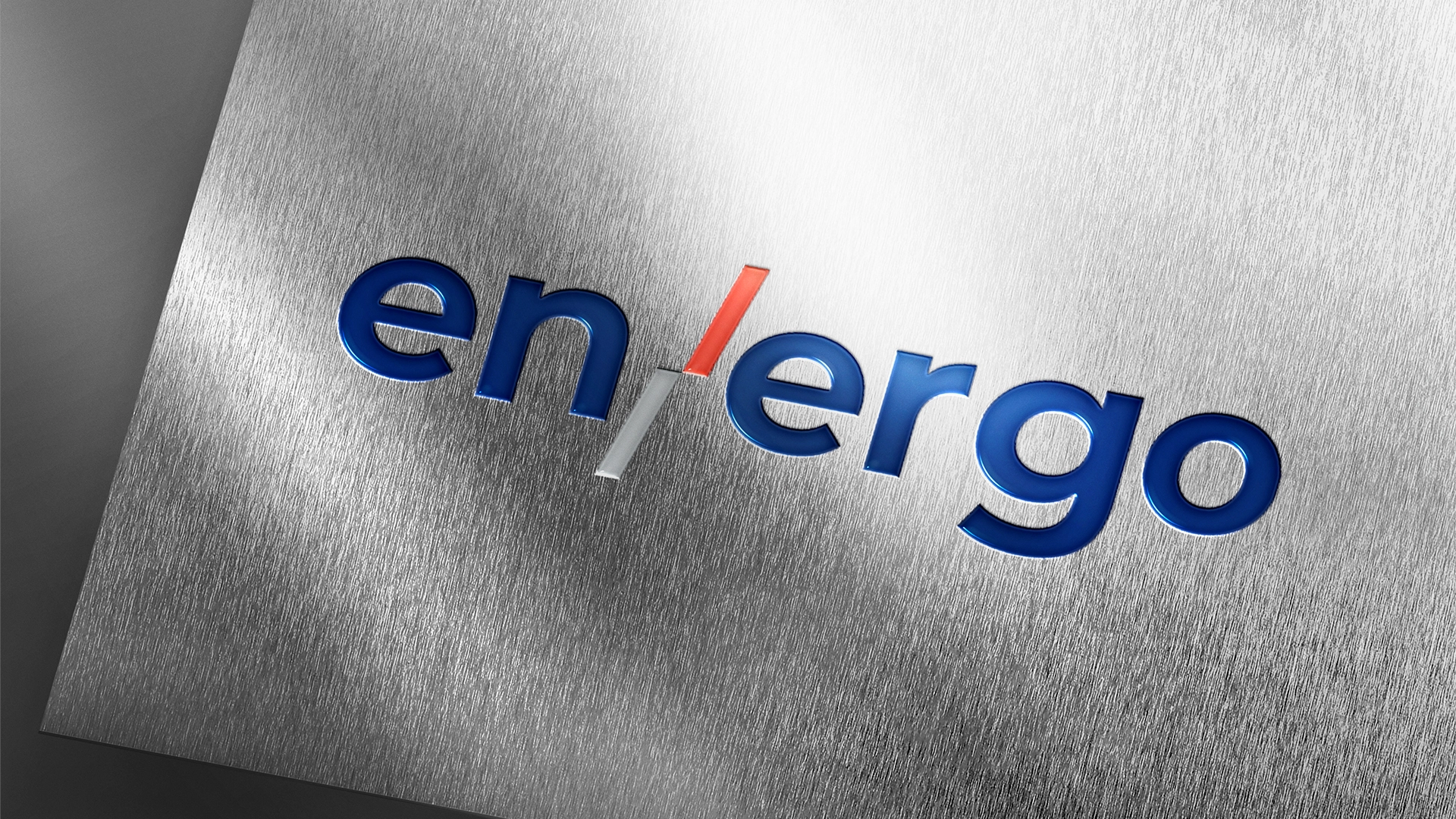
What we did:The birth of an identity rarely begins on a computer screen; it starts with a philosophy, rooted in the very words we use to define our actions. For this engineering brand, that foundational spark came from fusing two forces that are entirely inseparable in the physical world: energy and work. Out of that raw, linguistic collision, en/ergo was born, carrying with it a title that feels less like a corporate name and more like a law of physics.
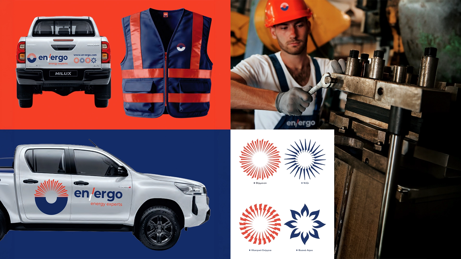
But a name alone cannot move a room, nor can it articulate the precision of modern engineering. To bridge that gap, a simple, intentional stroke was introduced: the angled slash. This single typographical mark became the horizon line of the entire identity, a visual conduit showing exactly how abstract study and rigorous engineering flow into tangible, physical implementation.
To ground this story in reality, the visual language needed to move away from cold, detached corporate tropes and instead embrace a living, breathing ecosystem of design.
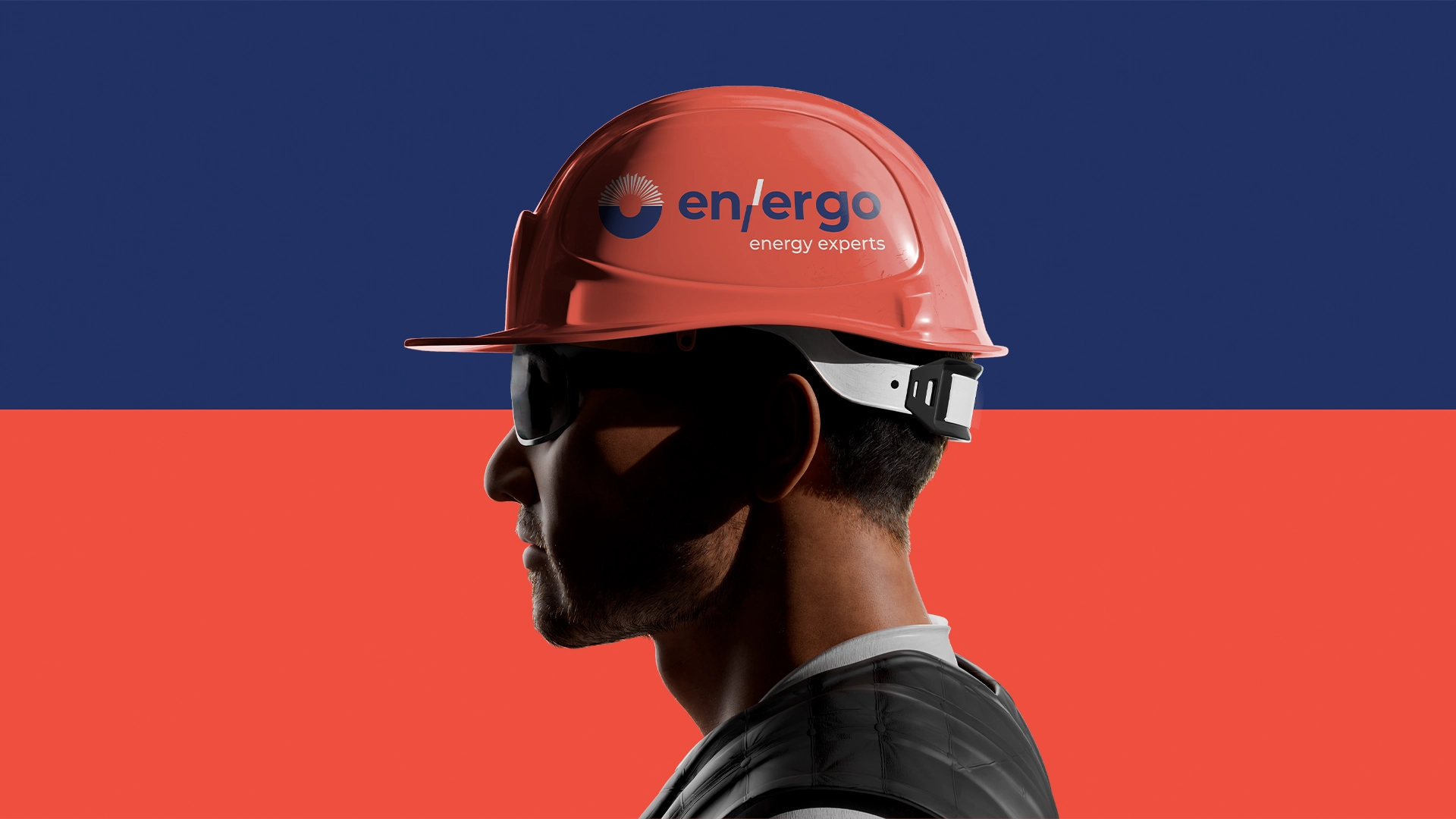
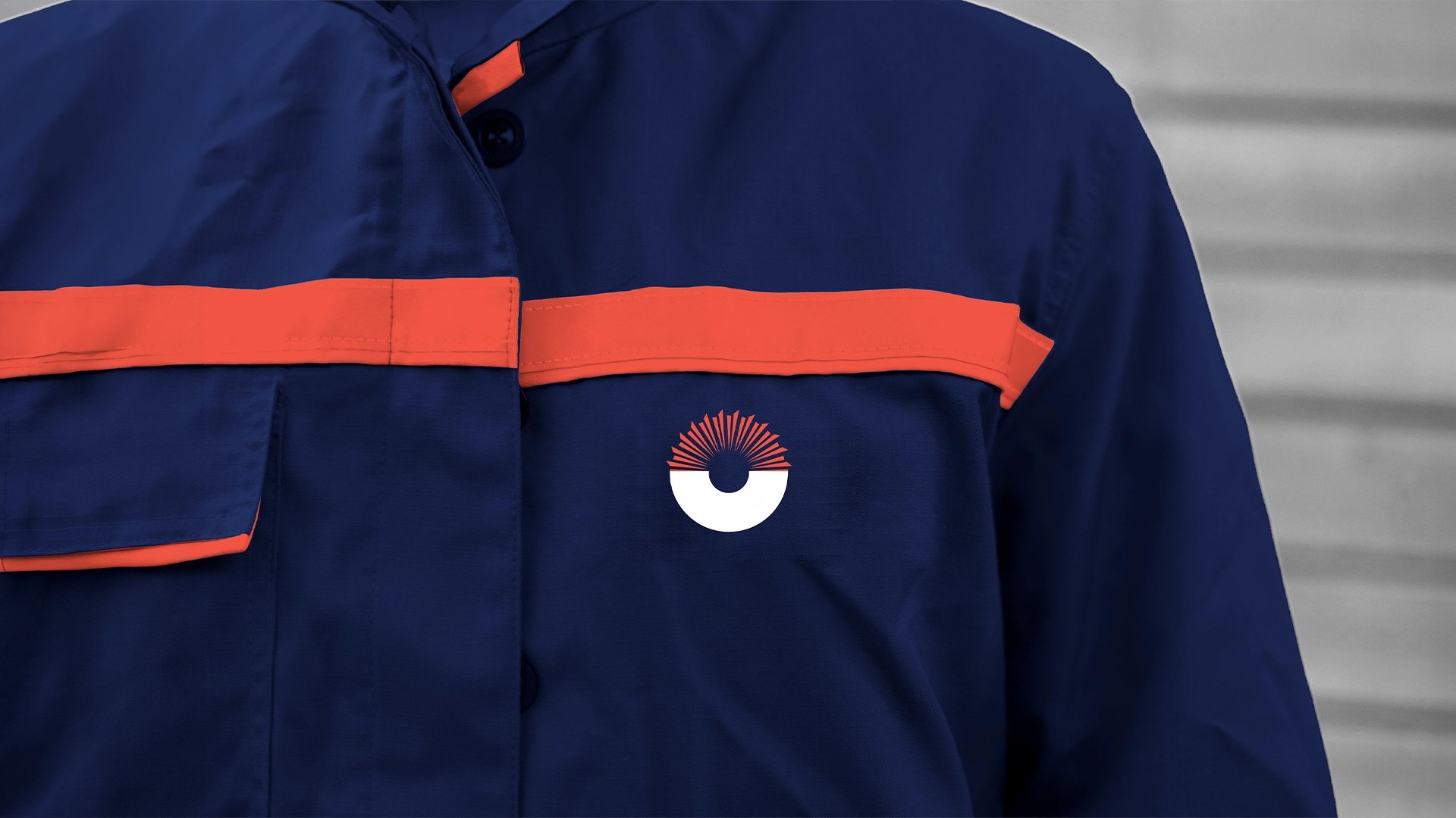
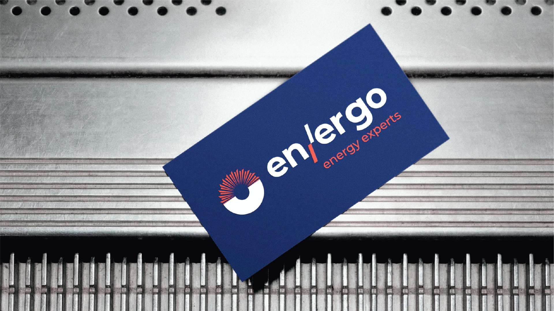
At the heart of this system sits a minimalist, geometric half-circle—a rising sun or a technical horizon—from which the entire brand radiates. From this central mark, the narrative splits into four distinct chapters of human comfort and mechanical mastery. Heating manifests as linear, outward-bound vectors of pure warmth; cooling takes shape as sharp, crystalline structures that evoke precision and frost; electricity flows through a jagged, fluid force; and natural gas completes the quadrology with an organic, looping flame geometry. These are not merely standalone icons; they are chapters of a larger book, effortlessly tiling and rotating into a complex corporate pattern that wraps around everything from digital interfaces to architectural spaces.
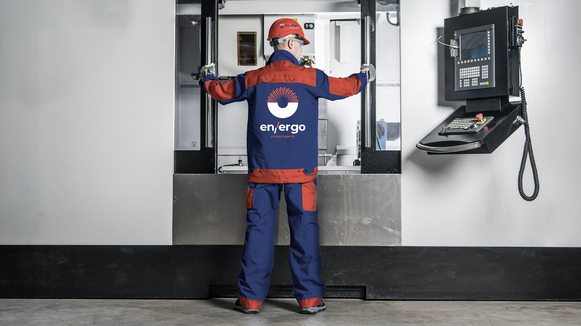
This story ultimately finds its voice when it steps out of the design studio and enters the field, where the elements are real and safety is paramount. The color palette mirrors this duality of intellect and action, balancing a deep, uncompromising industrial blue that commands trust with a vibrant, high-visibility orange that pulses with human energy and active work. When these elements converge—when the stark white variant of the core icon sits boldly against the heavy fabrics of high-visibility uniforms, wraps seamlessly around the curved surface of a hard hat, or scales dramatically across the side panel of a fleet vehicle—the narrative achieves its final form.
It ceases to be a technical analysis of services and becomes a living testament to real-world craftsmanship, a brand built for the “energy experts” who actively shape the comfort of our daily lives.
Date:
02/06/2026


