URBAN SPARK
Client: URBAN SPARK
What we did:A highly profound, multi-layered, and mature branding project for a company transforming the future of cities.
As a European programs consultant for public authorities and municipalities, Urban Spark required a visual identity that precisely balances bureaucratic rigor (structure, directives, KPIs) with the vision of urban regeneration (community, sustainability, innovation).
We created an identity that speaks the language of institutions yet carries the energy of change:
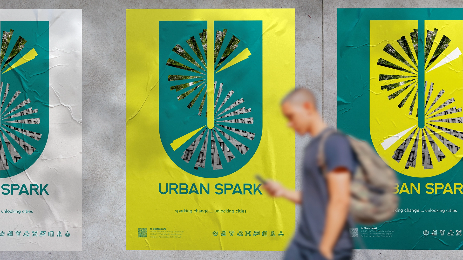
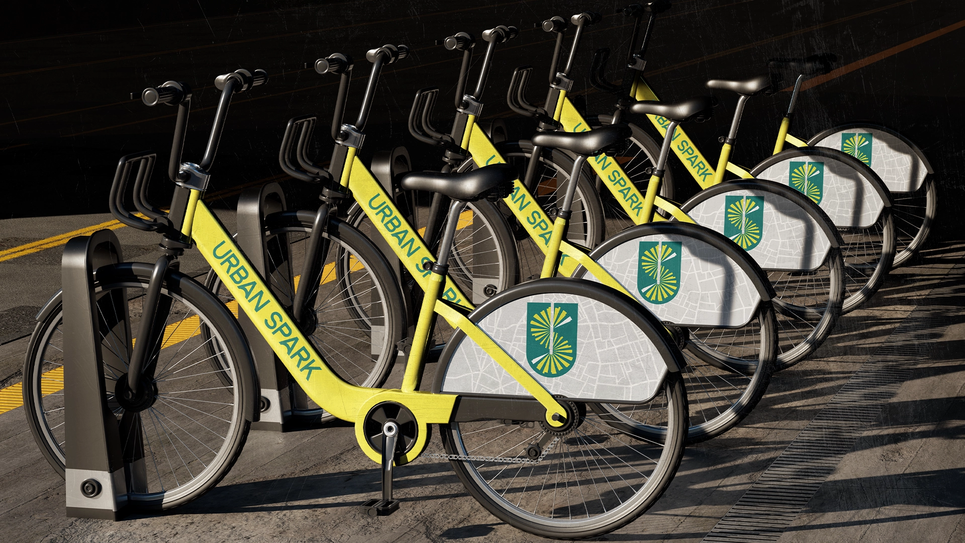
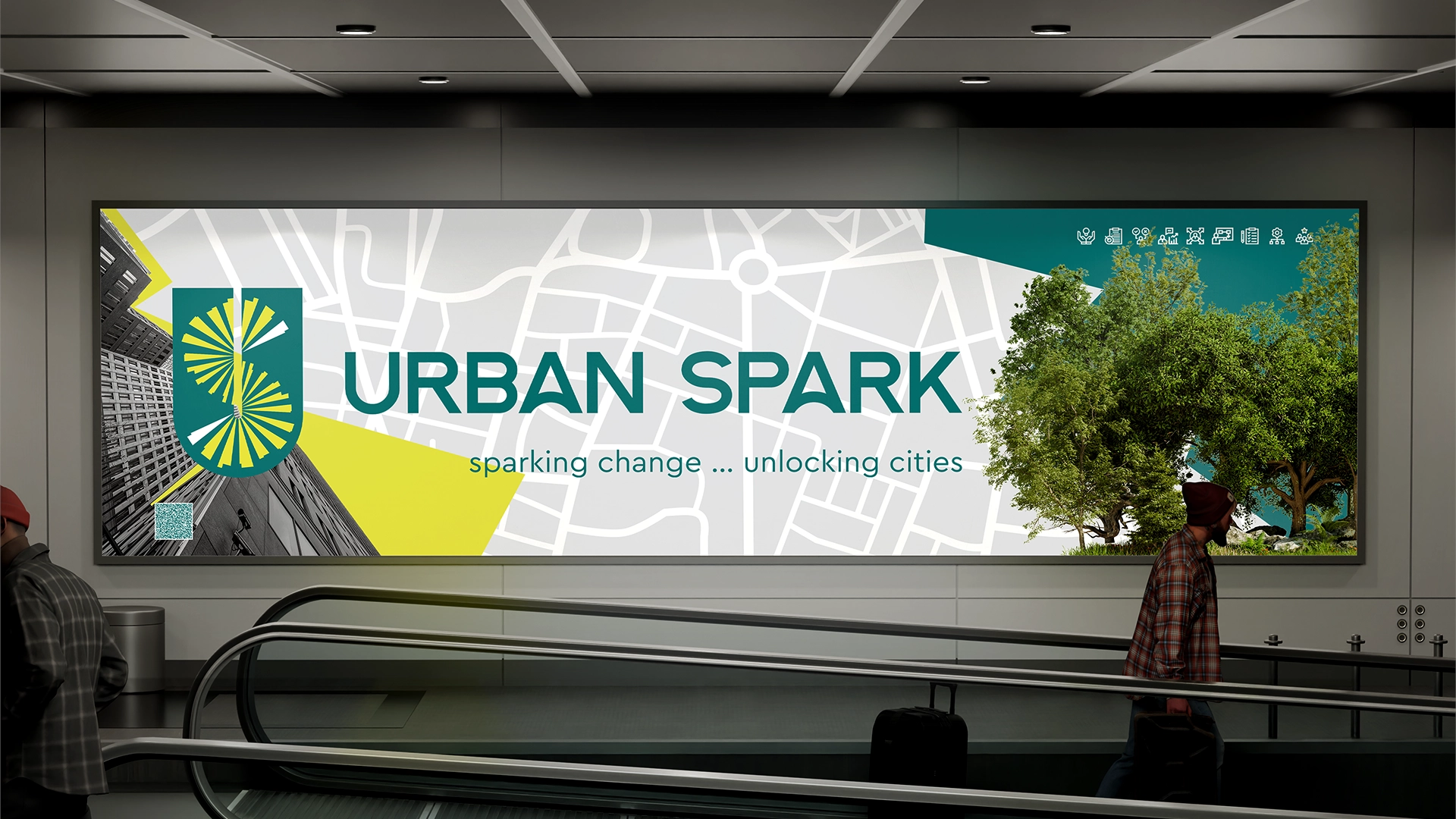
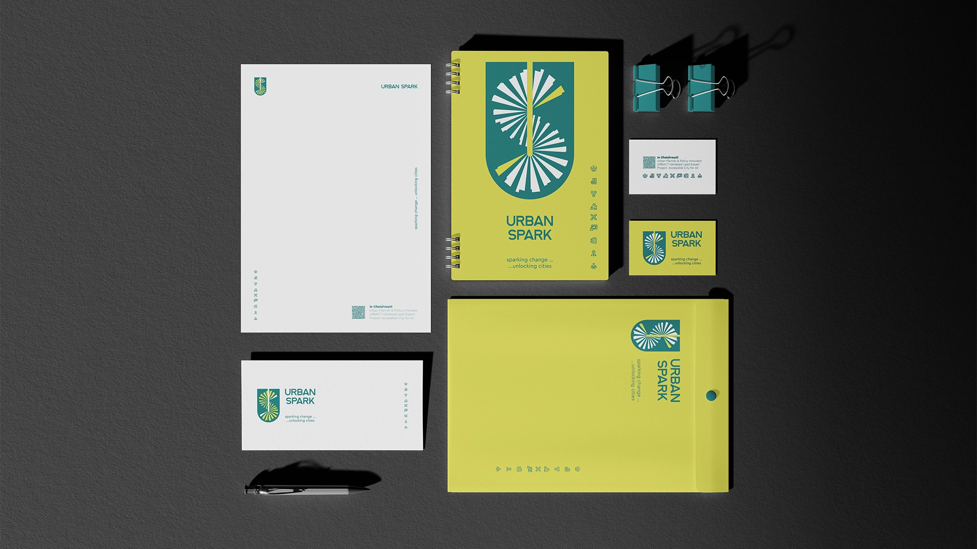
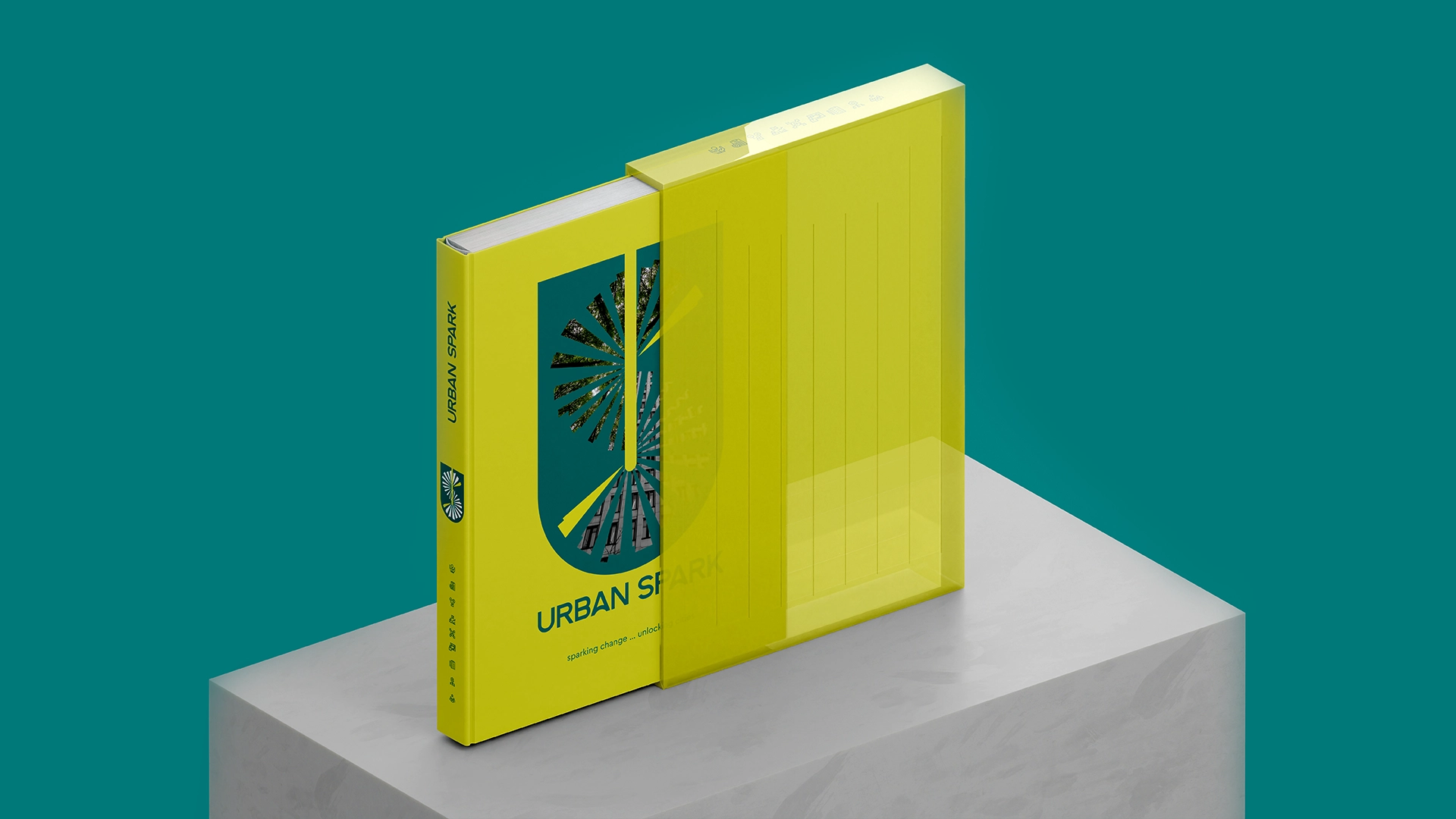
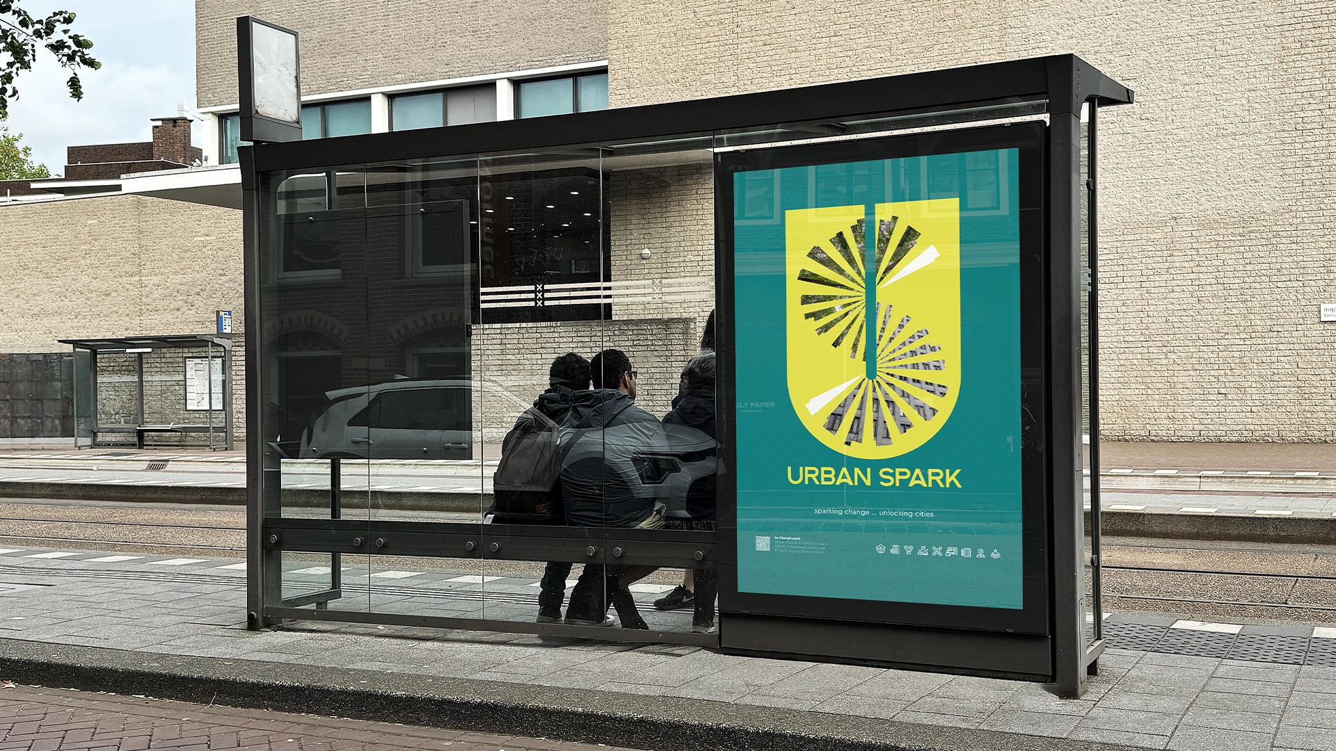
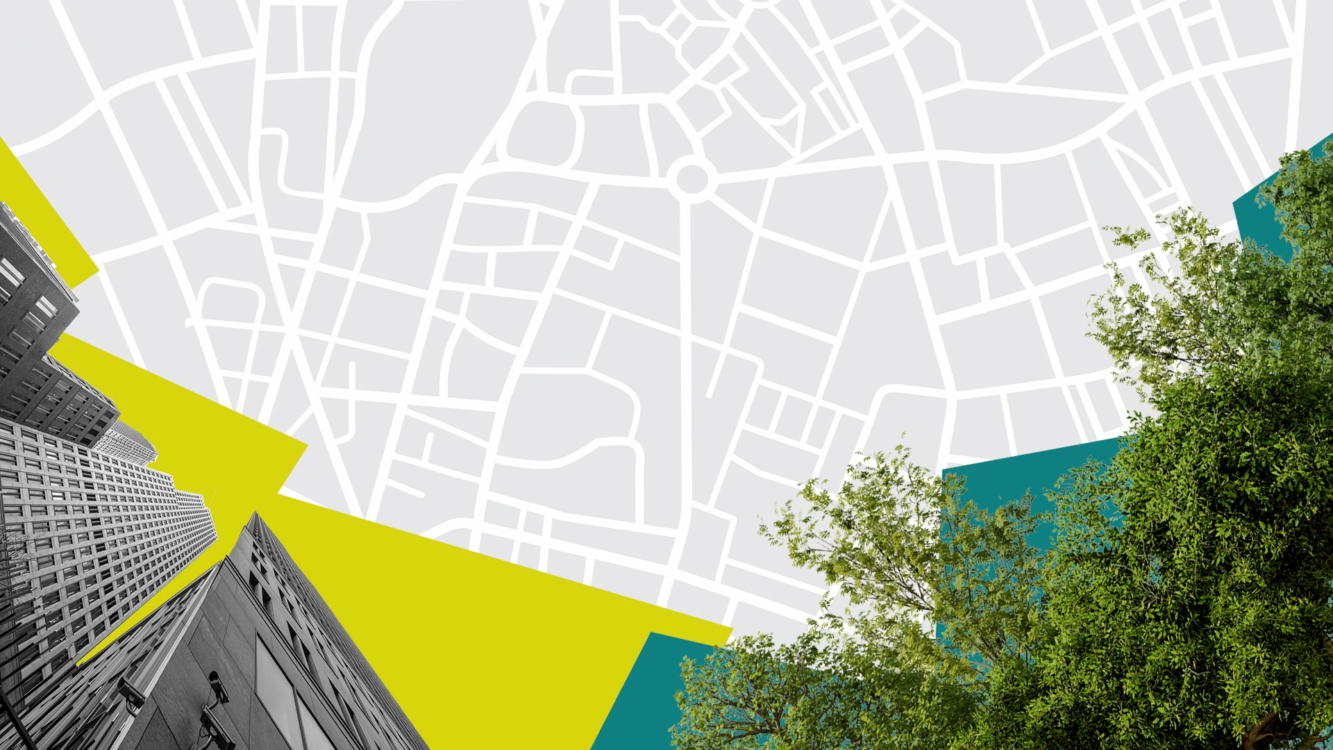
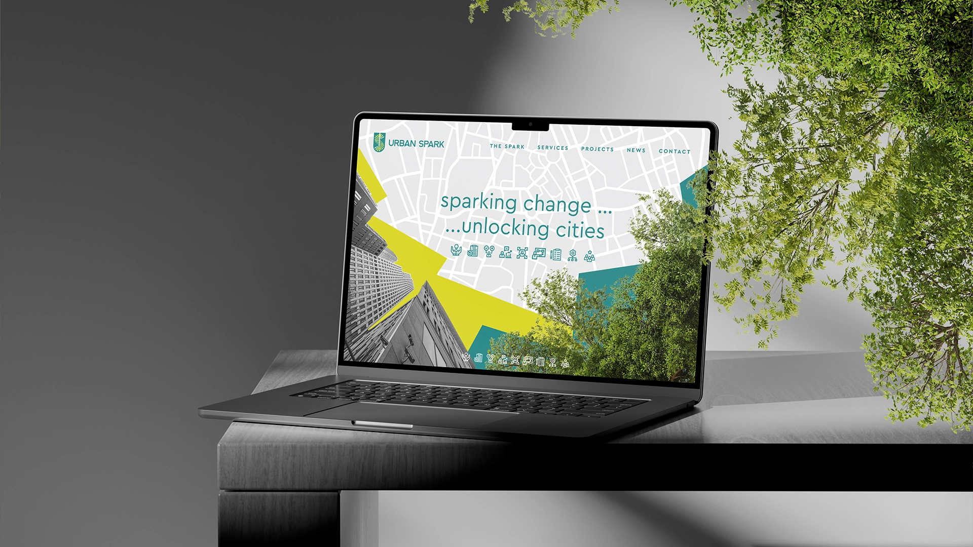
The electric teal offers the necessary gravitas and reliability.
The citrus yellow brings forth the “Spark” of innovation.
The “S” mark with concentric radial lines symbolizes the pulse of the city and the dissemination of results.
The typography, featuring the letter “A” in the shape of a bridge,
highlights connectivity.
Urban Spark is not your typical consulting firm, and this branding project proves it. It is modern, structured, and perfectly aligned with the vision of transforming our cities.
Date:
02/06/2026


