
Posidonia brain
Client: POSIDONIA BRAIN
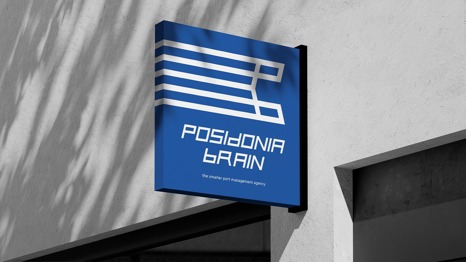
Slogan: The smarter port management agency
What we did:The maritime sector is built on monumental scale, yet its modern survival relies entirely on precision, intelligence, and foresight. As a long-term client from Athens, Posidonia Brain has evolved over the past decade into the region’s most well-organized and sophisticated “smarter port management agency”.
Our strategic objective was to clearly communicate this ten-year evolution, repositioning the brand through a completely refreshed identity and dynamic media rollout.
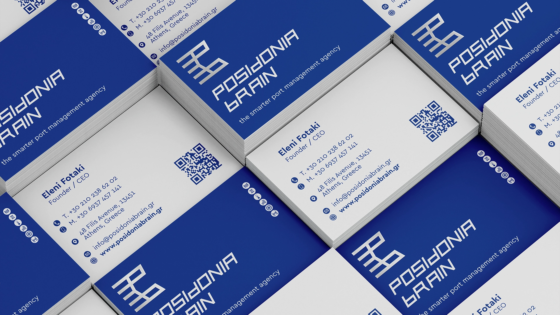
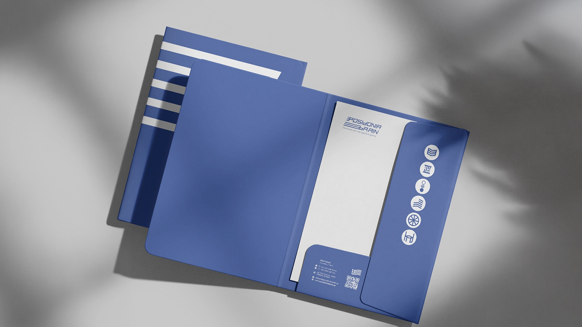
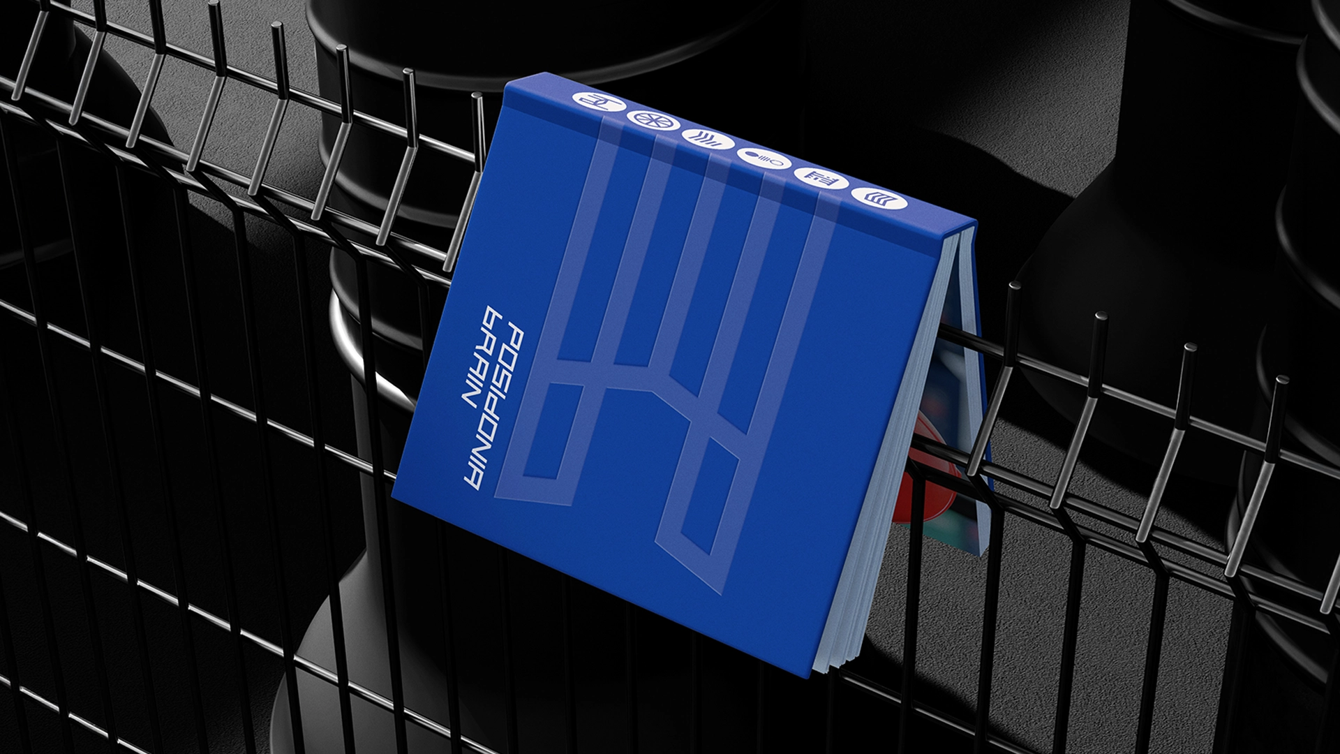
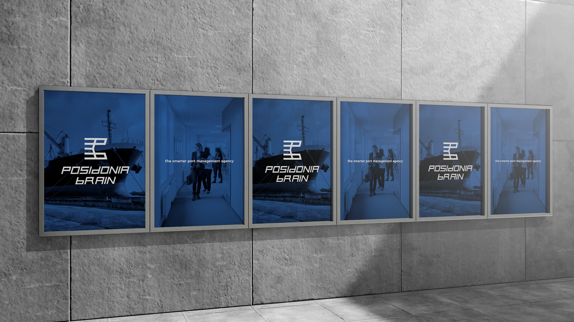
To achieve this, we developed a timeless, creative, and bold monochrome logotype and brand mark rooted in a sophisticated business aesthetic. The geometric mark expertly communicates the origin and premium quality of the agency’s values by seamlessly combining the structural forms of the letters P and B with the iconic lines of the Greek flag. This custom typography establishes an immediate sense of industrial strength, stability, and digital precision across all touchpoints.
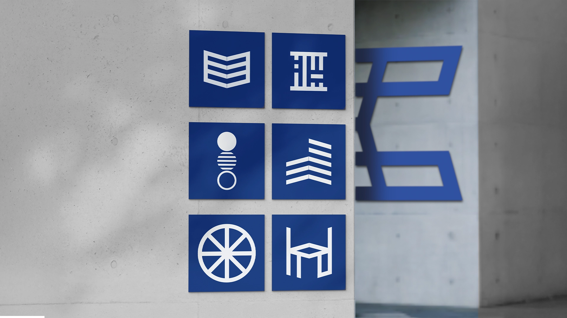
We expanded this corporate ecosystem by creating a specialized set of six custom minimalist service icons to provide deep operational clarity. Representing core pillars like regulatory compliance, port administration, and continuous advisory support, these graphics seamlessly adapt to both physical concrete architecture and premium corporate folders.
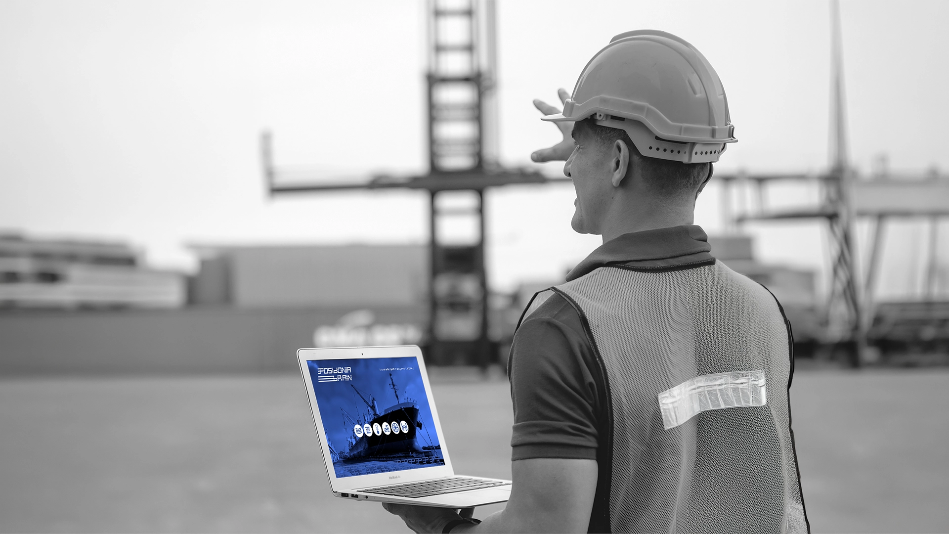
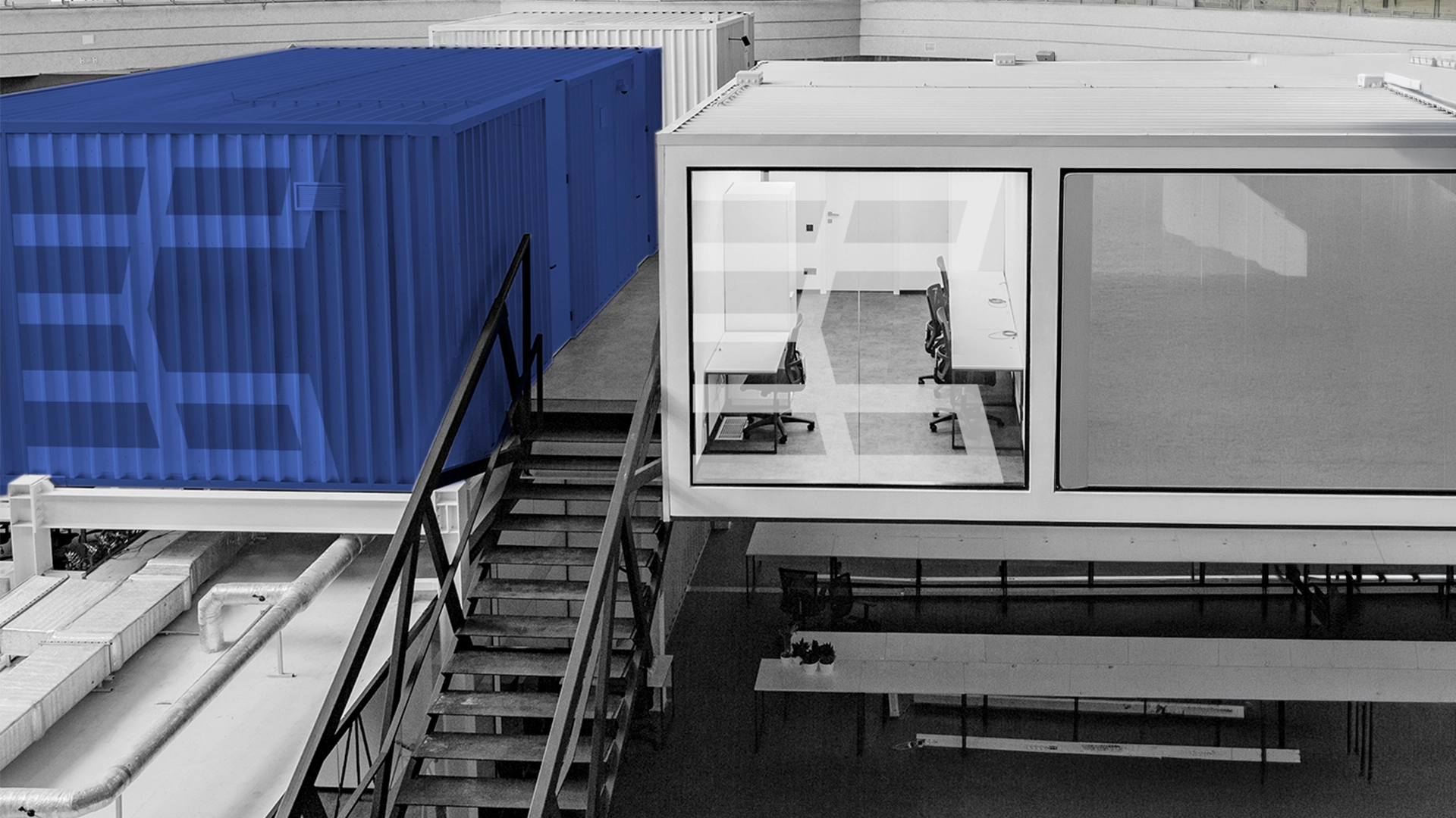
This balance between high-end corporate presentation and rugged, real-world utility allows the brand to seamlessly command the landscape—whether integrated onto real-time field-testing applications for port operators, displayed on professional networking business cards, or scaled onto massive shipping containers lifted by terminal machinery.
By bridging structural infrastructure with a sophisticated visual layout, the new identity definitively positions Posidonia Brain as the intelligent mind driving the future of modern ports.


