
MO JEWELLERY
Client: Mo Jewellery
Slogan: Mo-re than jewellery
Services: Branding / Packaging
What we did:
The Challenge / The Goal
MO Jewellery required a bold brand transformation that rejected sterile commercialism to establish an authoritative, deeply resonant B2B and consumer presence. Moving away from predictable retail clichés, the strategic objective was to capture the raw, untamed essence of Earth’s primal elements—minerals, volcanic textures, and elemental forces—and translate them into a high-end luxury identity.
The Solution / Our Approach
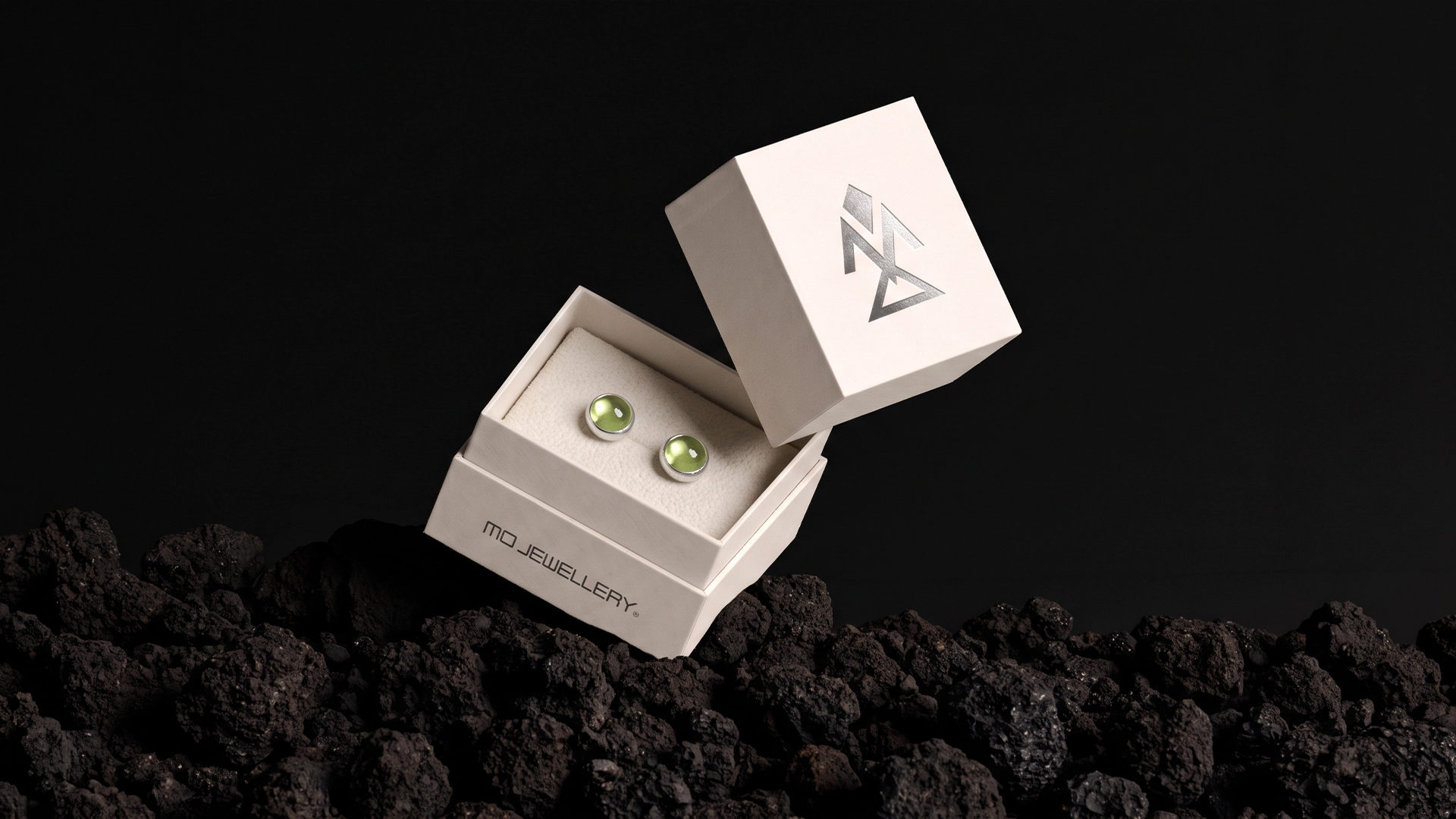
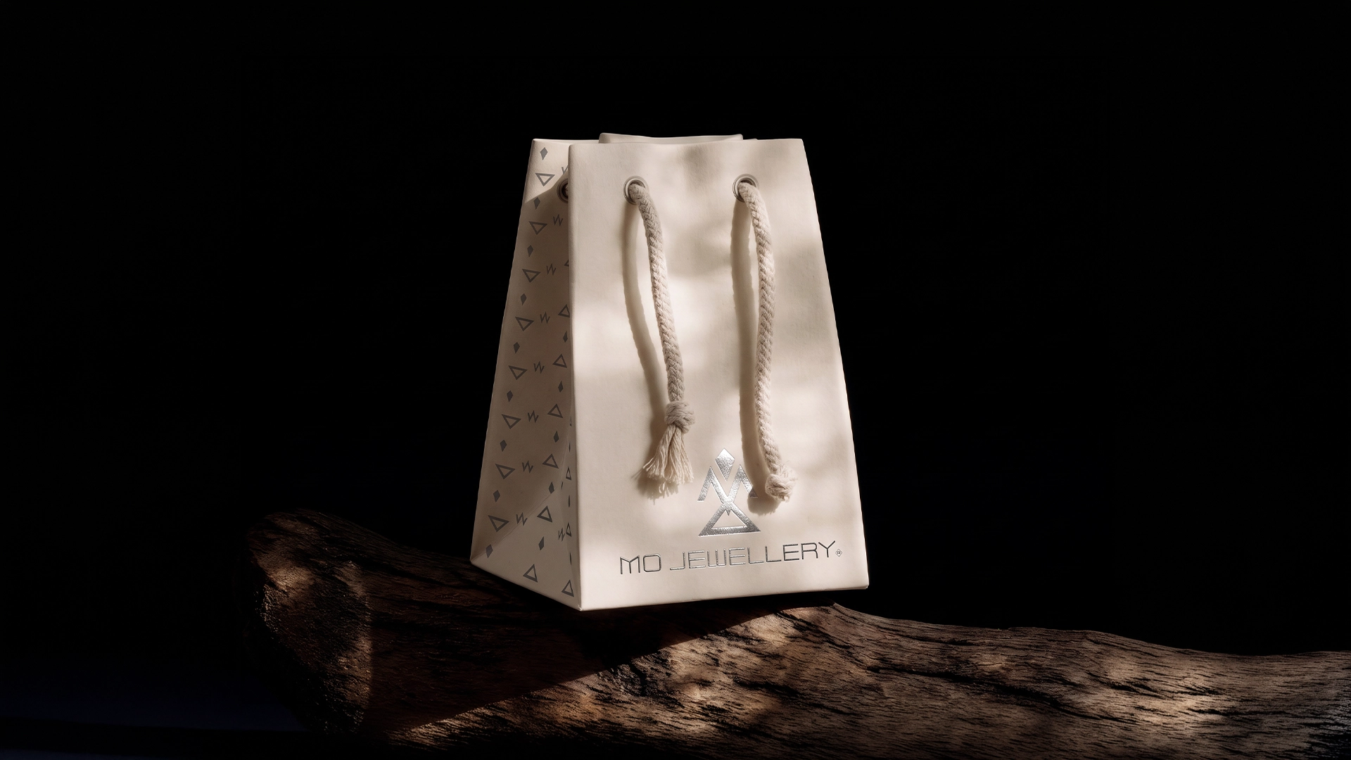
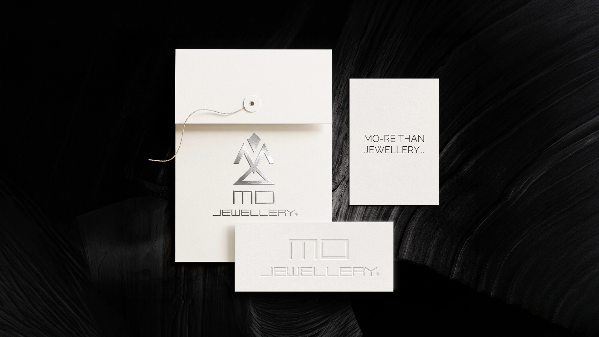
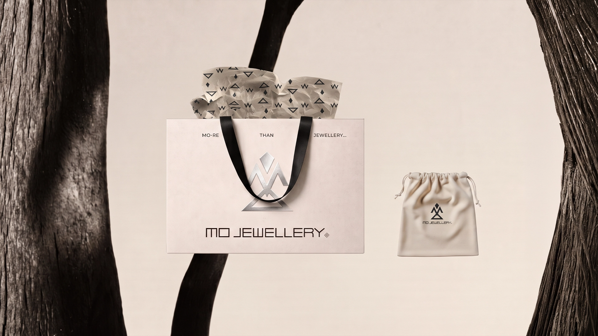
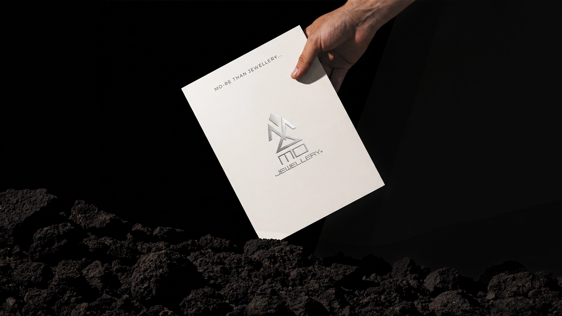
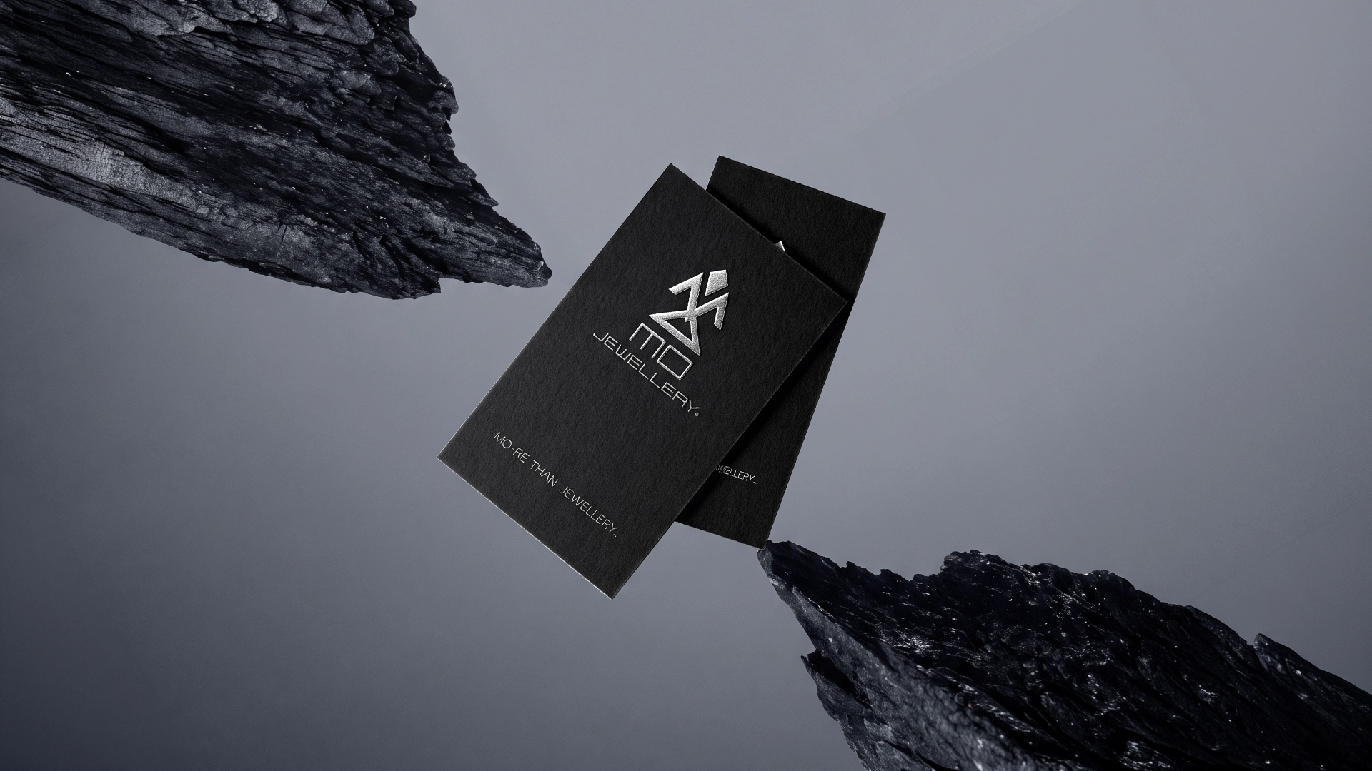
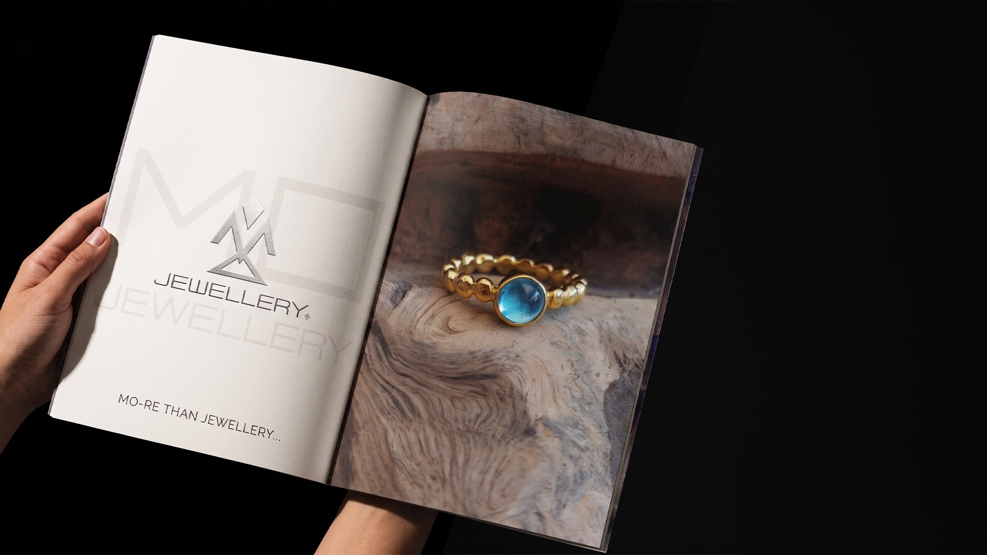
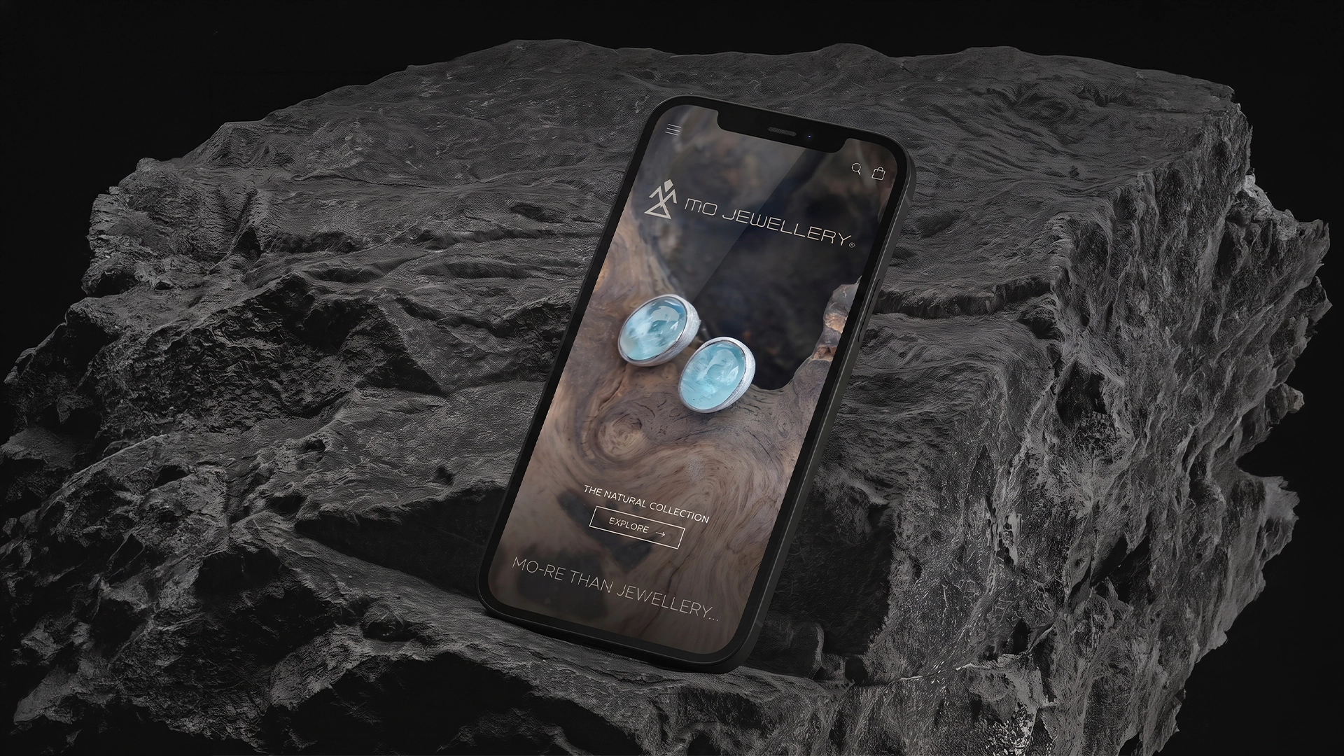
Our visual language merges obsidian blacks, raw geological grey gradients, and stark metallic silver foils with minimalist typography and custom geometric iconography. We engineered a complete collateral ecosystem, including textured rigid boxes, artisan carry bags featuring geometric pattern tissue, bespoke stationery suites, and an immersive editorial brand manual and responsive mobile UI. As showcased in our conceptual motion reel, every asset traces the brand journey from raw earth and molten extraction to refined craftsmanship.
The Result
The resulting identity positions MO Jewellery as a dominant, uncompromising market leader where fine craftsmanship meets elemental power. By combining tactile unboxing experiences with sophisticated digital touchpoints, the brand commands immediate premium authority, attracting discerning global clients who recognize jewellery not merely as adornment, but as an extension of nature and legacy.
Date:
25/07/2025


