

SAPPHO’S IMEROS
Client: Sappho’s Imeros
Services: Branding / Packaging
The Challenge / The Goal
The olive oil export market is heavily saturated with traditional, rustic aesthetics that fail to communicate true premium gastronomic value. The goal for “Sappho’s Imeros” was the creation of a commanding, high-end corporate identity from scratch, breaking local stereotypes and “safe” design approaches. We needed to position this extra virgin olive oil as a dominant, luxury export commodity, securing its presence in high-end culinary and boutique retail sectors by reflecting its heritage through a strictly modern, B2B lens.
The Solution / Our Approach
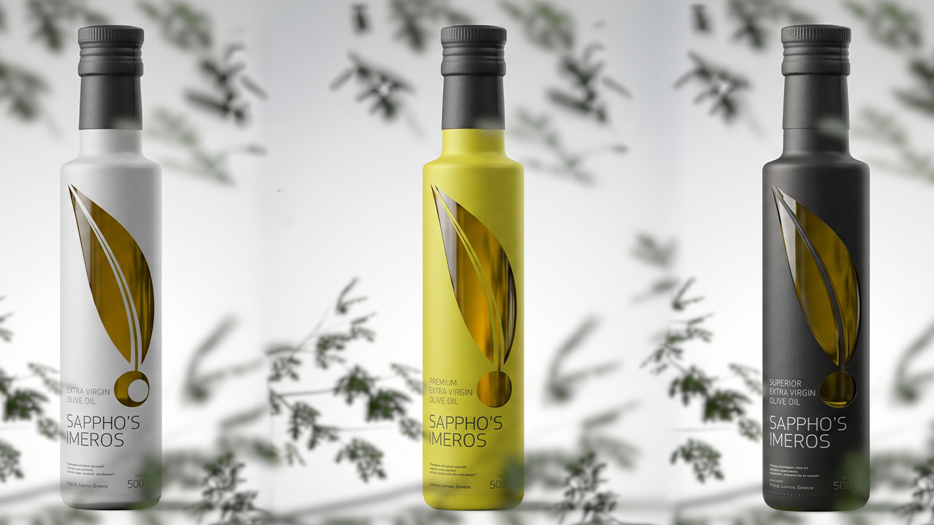
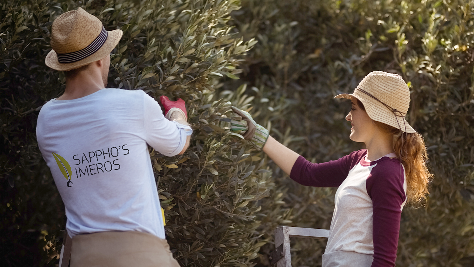
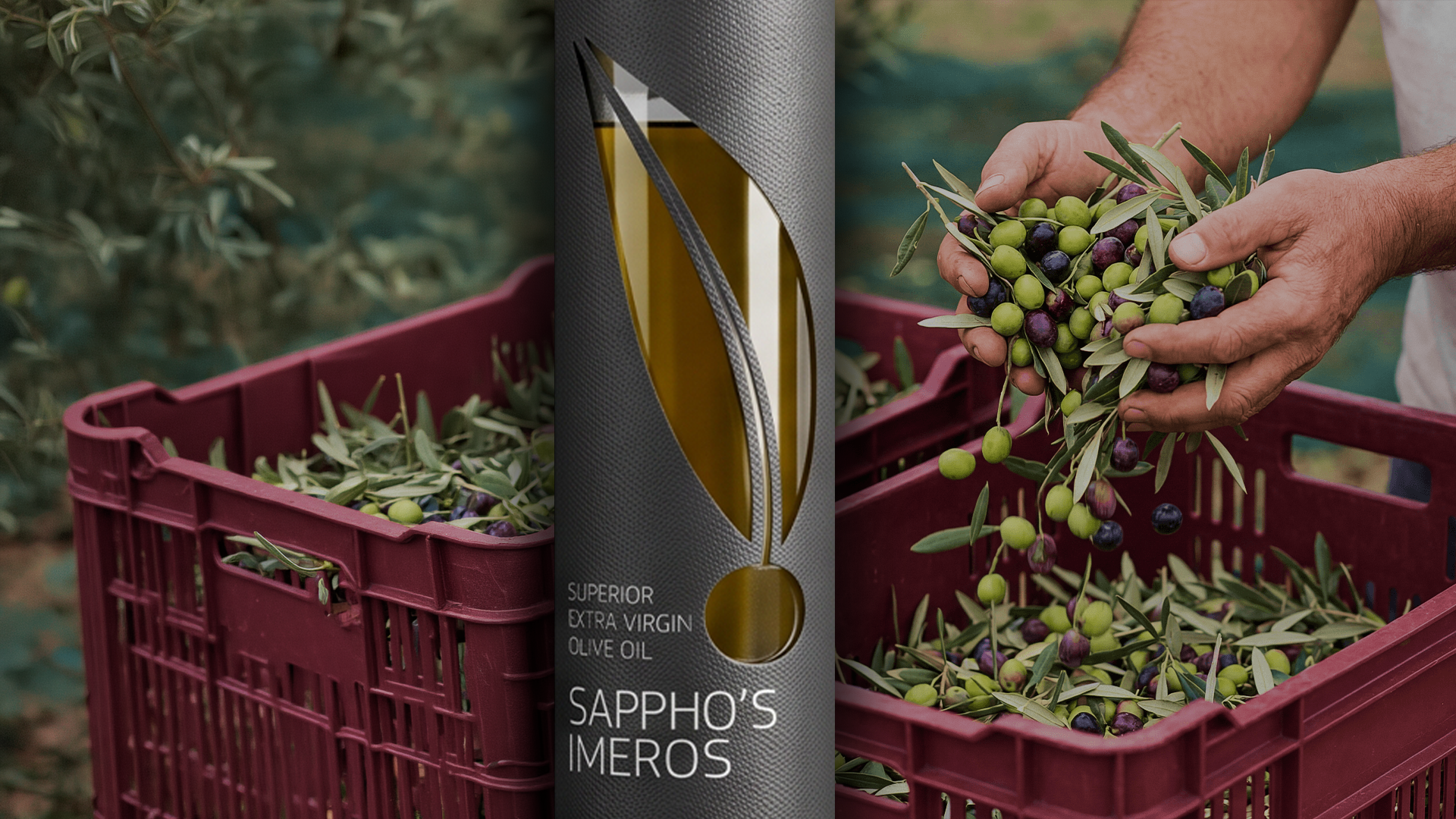
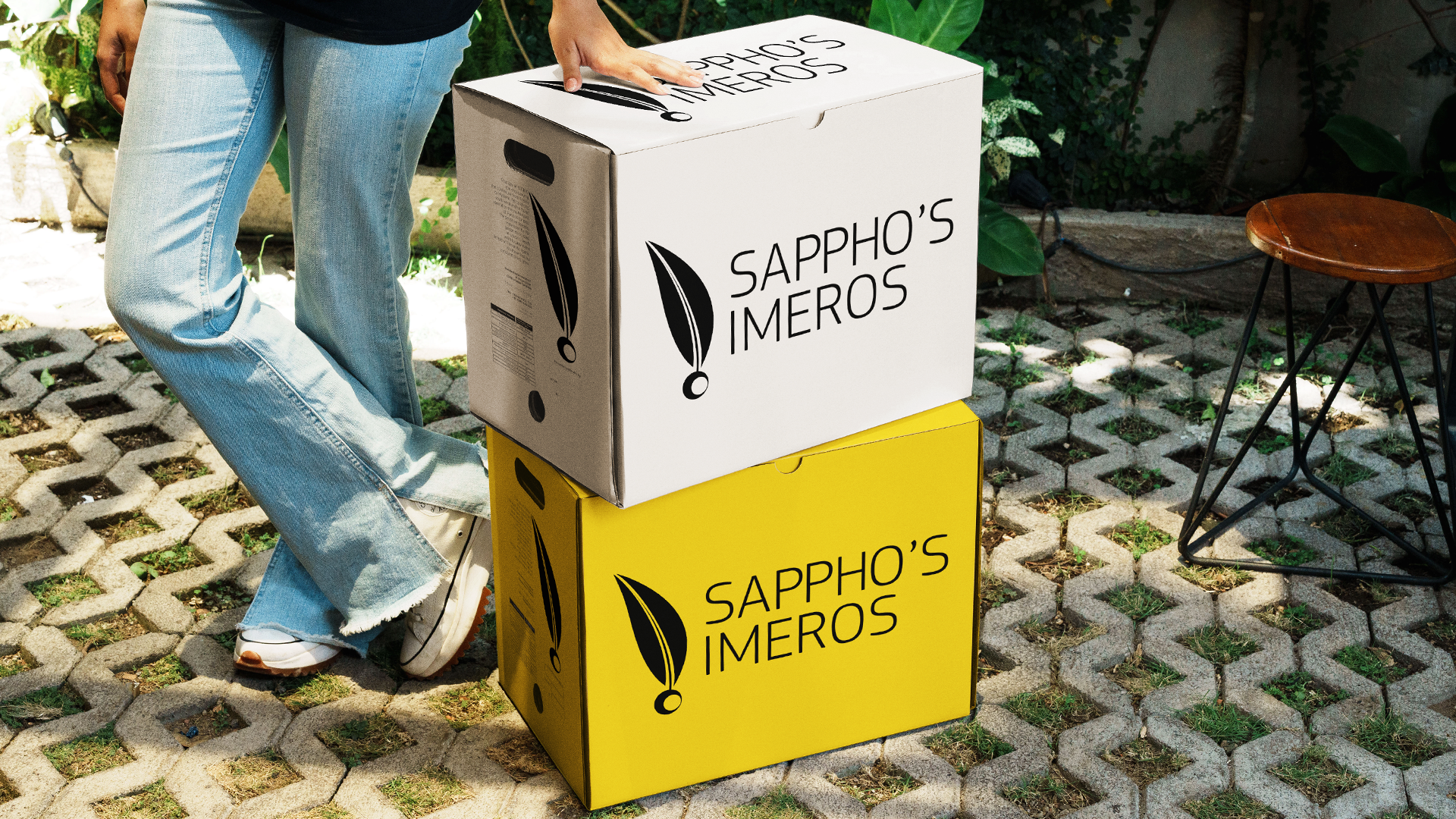
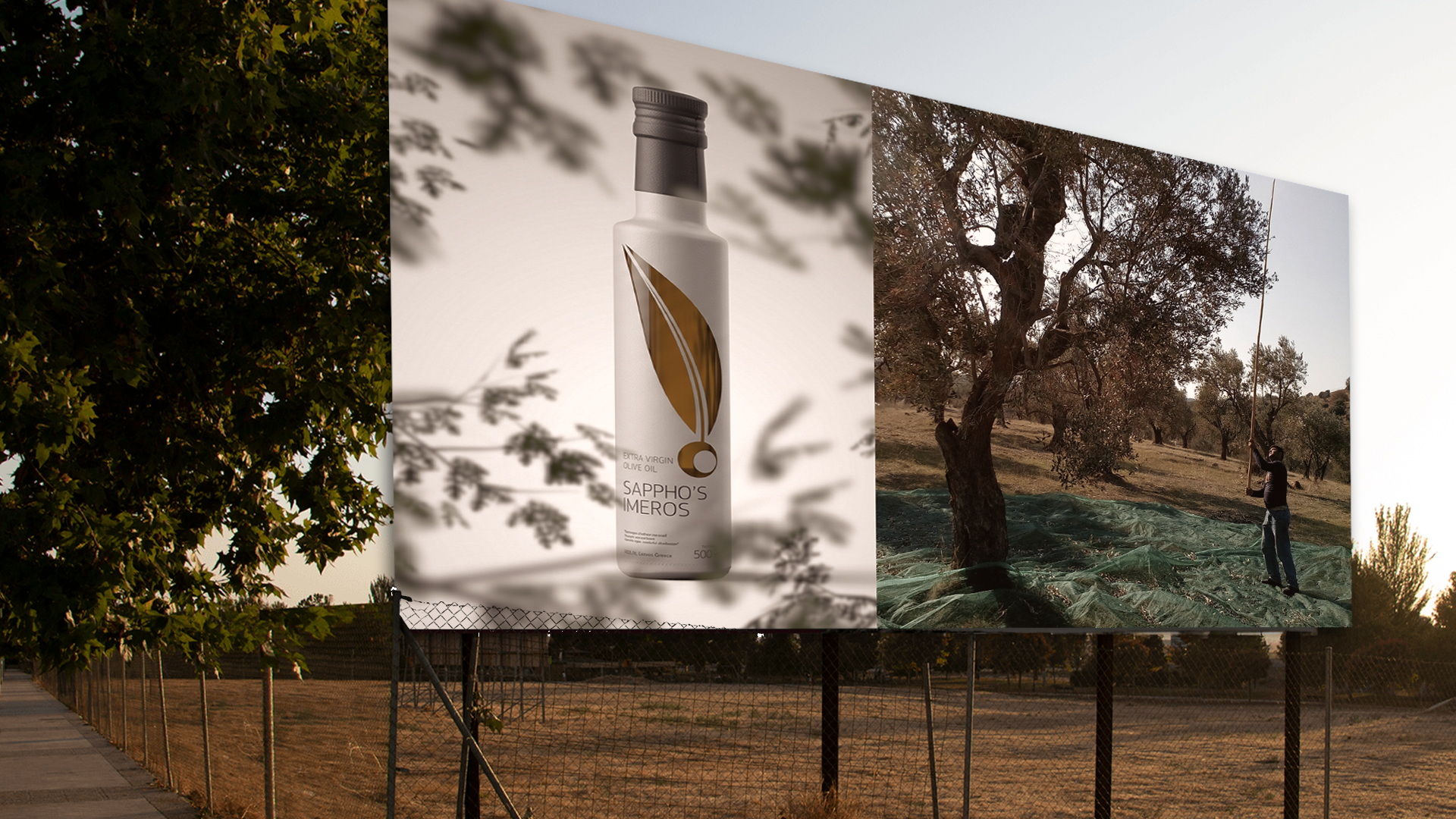
We designed a sharp, minimalist visual language anchored by a strict, sans-serif typographic logo and a distinct emblem uniting the olive leaf with a drop. To instantly differentiate the product quality tiers, we developed a three-color packaging system utilizing sleek, matte bottles: a commanding black for the “SUPERIOR” line, a pristine white for “EXTRA VIRGIN,” and a vibrant, dynamic yellow for “PREMIUM.” The brand ecosystem was strategically extended across high-impact outdoor advertising, functional corporate apparel for the harvest, and bold shipping cartons designed for an optimized B2B wholesale experience.
The Result
The finalized identity transforms “Sappho’s Imeros” into a definitive luxury lifestyle brand, definitively distancing it from the image of a simple agricultural product. The bold color blocking and flawless visual consistency grant the product immediate shelf authority and high perceived value, successfully repositioning the brand to attract premium global distributors, strategic high-end culinary partners, and discerning consumers.
Date:
12/12/2025


