
TRUE NORTH
Client: True North Travel
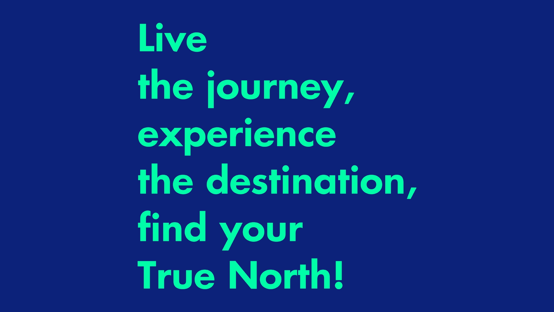
Slogan: Live the journey, experience the destination, find your true north.
What we did:
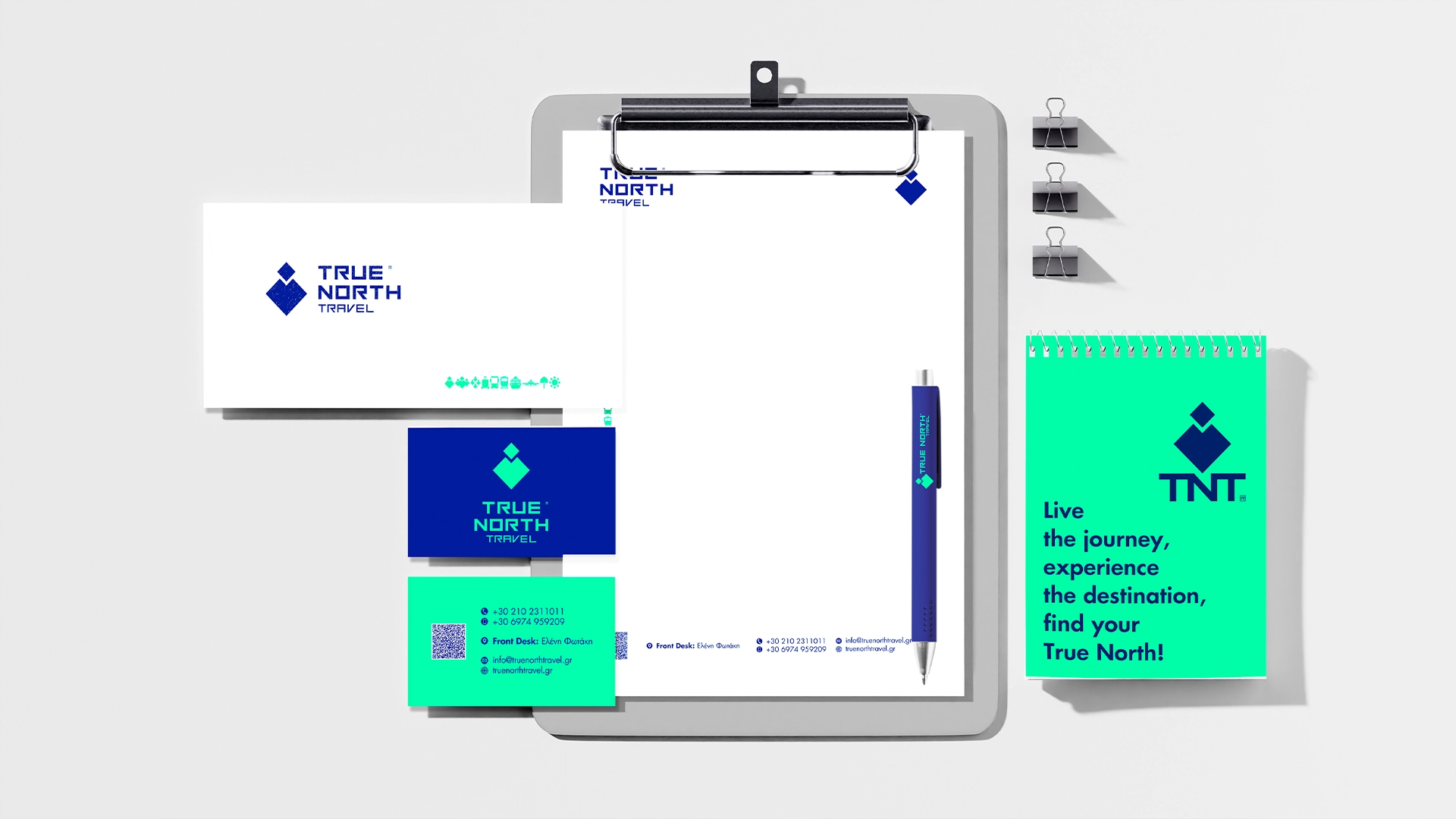
>> The corporate identity of True North Travel was created to serve as a steady, reliable compass for those wishing to explore the world with absolute confidence. The brand’s philosophy is rooted in human connection, genuine guidance, and the promise to support the traveler every step of the way.
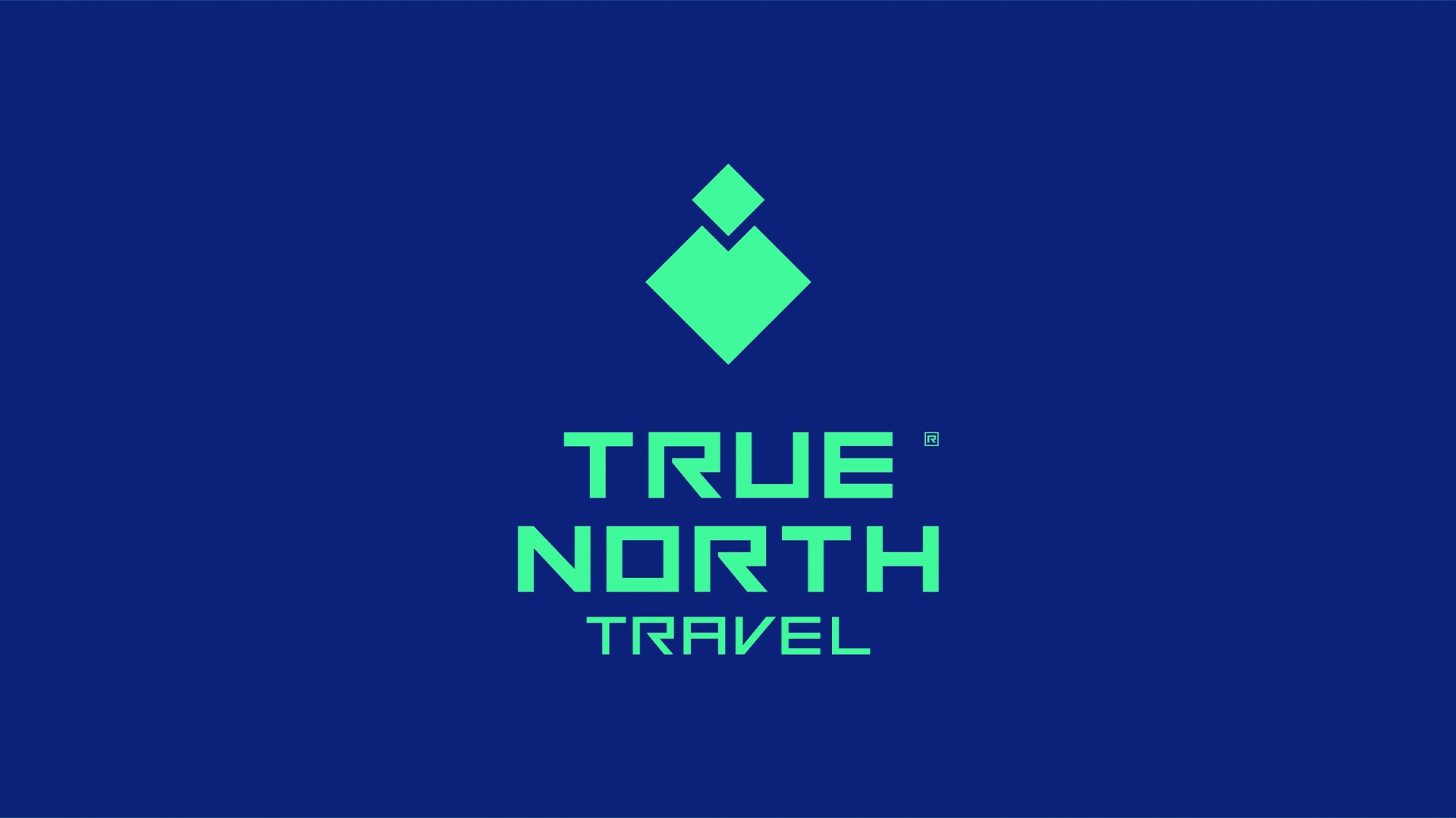
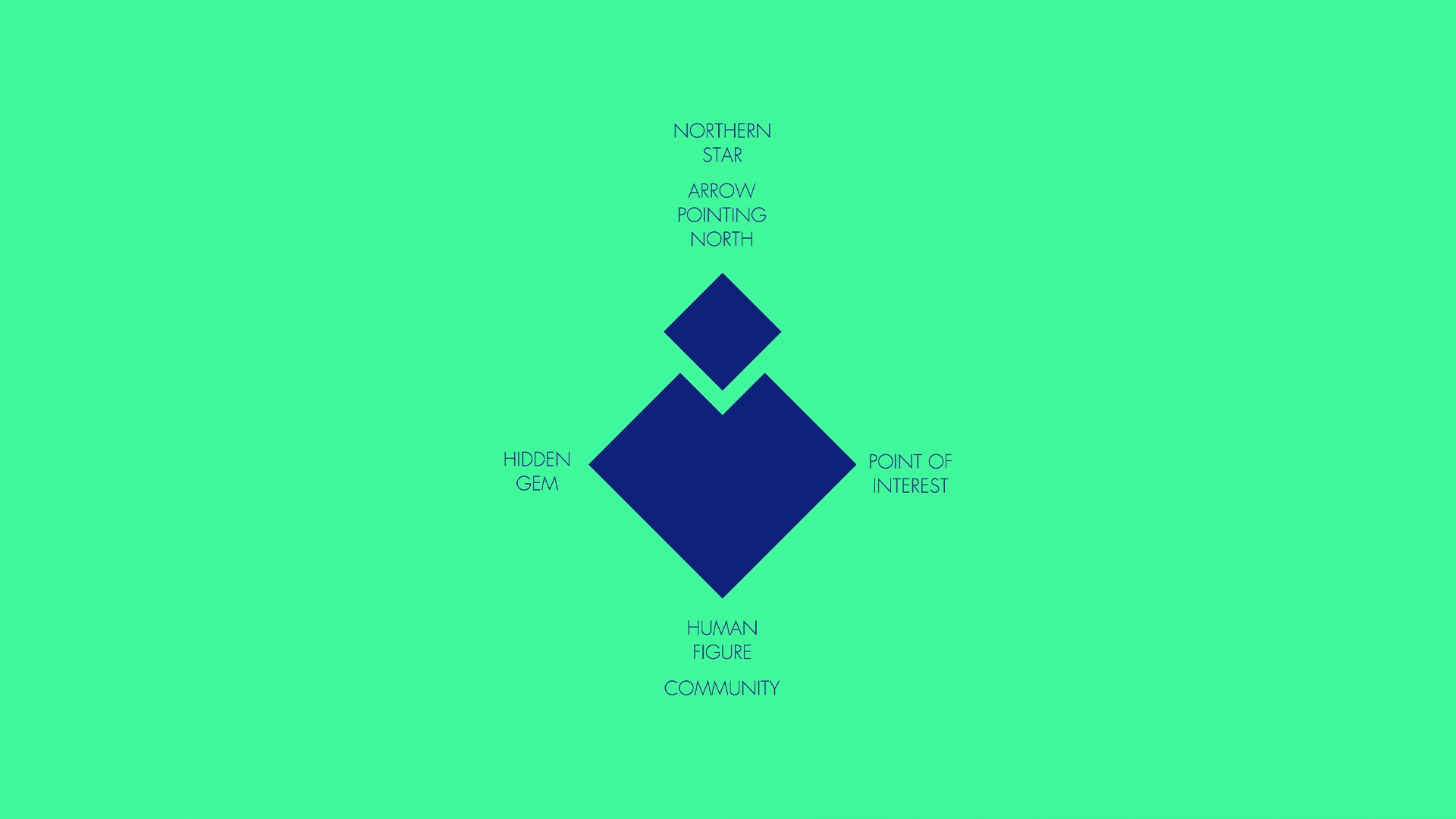
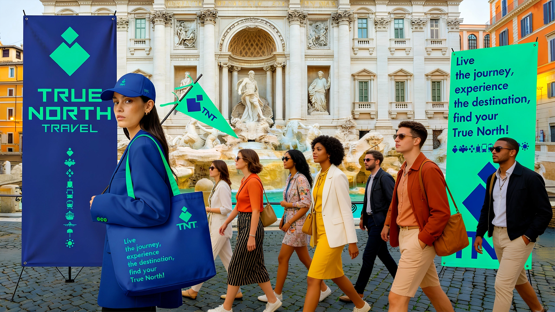
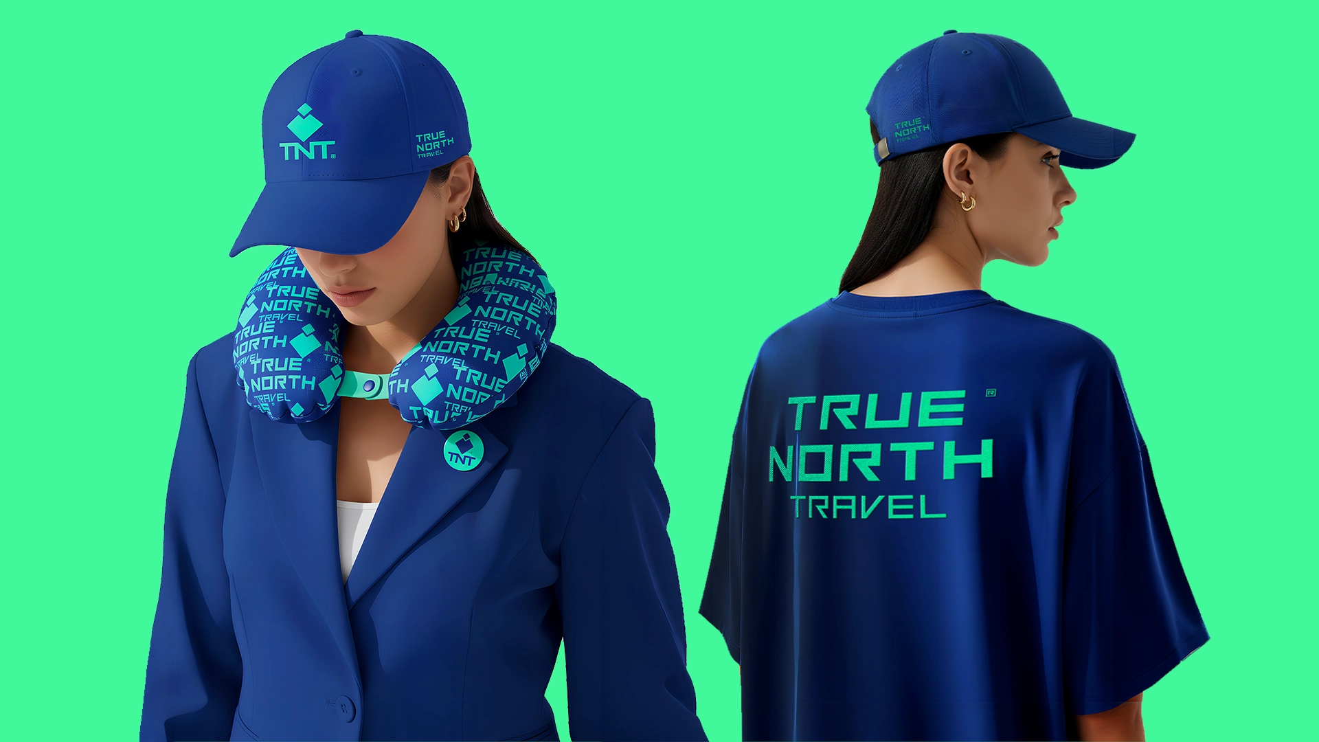
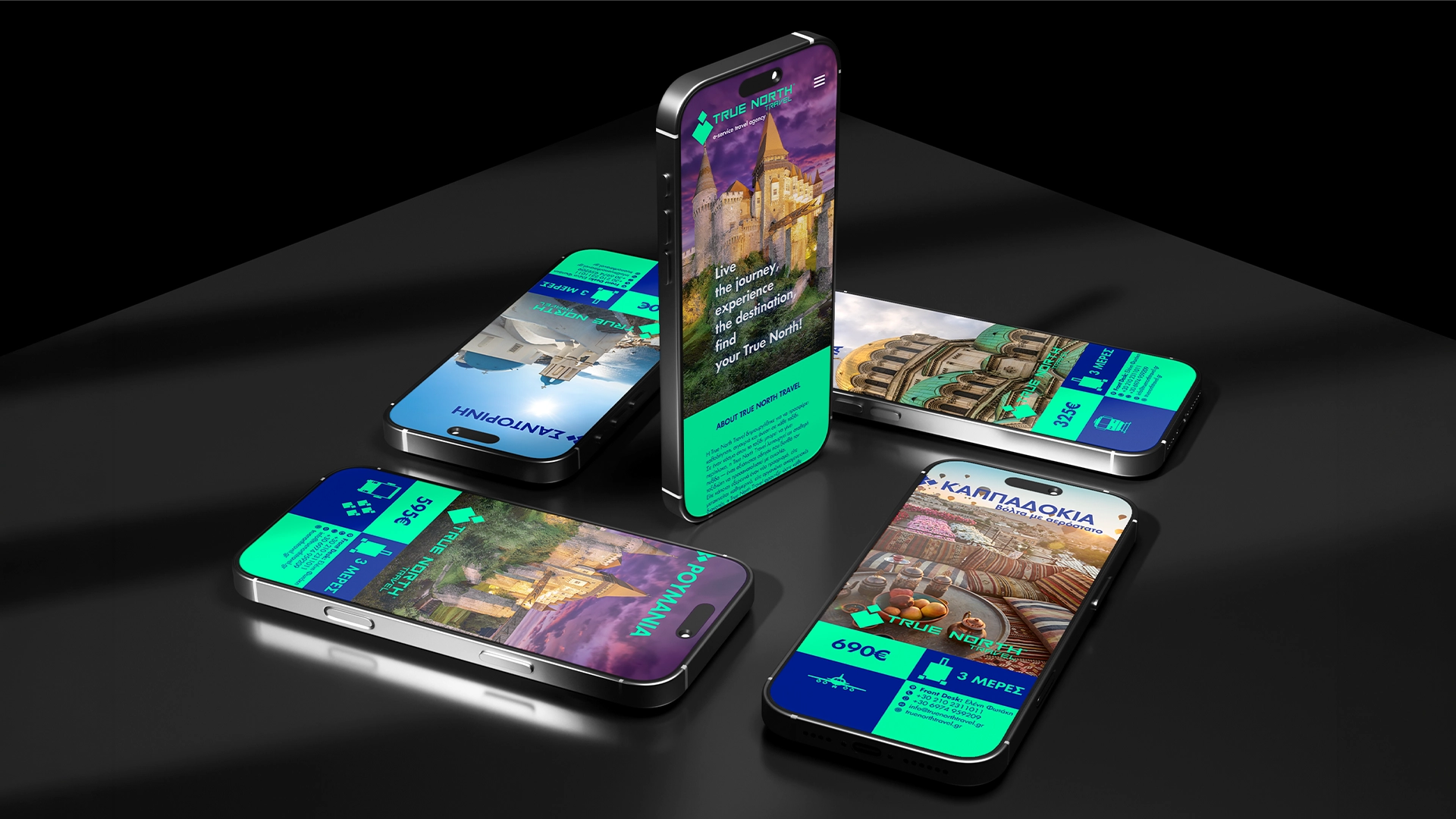
The visual language transitions seamlessly from the design studio to real-world experiences, anchored by the elegant typography of the master brand mark. The core symbol—a geometric composition of two vertical diamonds—is a deliberate nod to the North Star and the compass needle pointing to magnetic north. Utilizing a vibrant color palette of bold Royal Blue and Fresh Light Green, the identity bridges the professional stability required of an elite agency with the fresh, dynamic spirit of open-road adventure. This duality comes to life digitally in a completely organic way.
Through a thoughtful blend of storytelling and design consistency, True North Travel has become the trusted companion that makes the journey as beautiful as the destination.
Date:
02/06/2026


